


I like abstract painting because I can start with color and see where it takes me.
I don’t need to plan every shape or draw a sketch first.
When I want an easy project, I reach for a few paints and let the marks build naturally.
These 24 ideas are simple ways to get started, even if you’re not sure what to paint.
Layered Color-Block Abstract Painting

Build an abstract composition from broad coral, teal, and golden-yellow shapes, then add a few curved white lines that cross between the color blocks. The rough painted edges and small drips keep the decorative design loose, while the overlapping shapes give it a clear sense of movement.
The large areas of color make this idea easy to adjust to a canvas of almost any size, and the white curves can help connect shapes without needing a sketch. Try swapping in colors that suit your room, or simplify the layout to two painted shapes and one sweeping line for a more minimal version. The bold palette and graphic layout also make it easy to spot in a Pinterest feed.
Overlapping Watercolor Color Fields
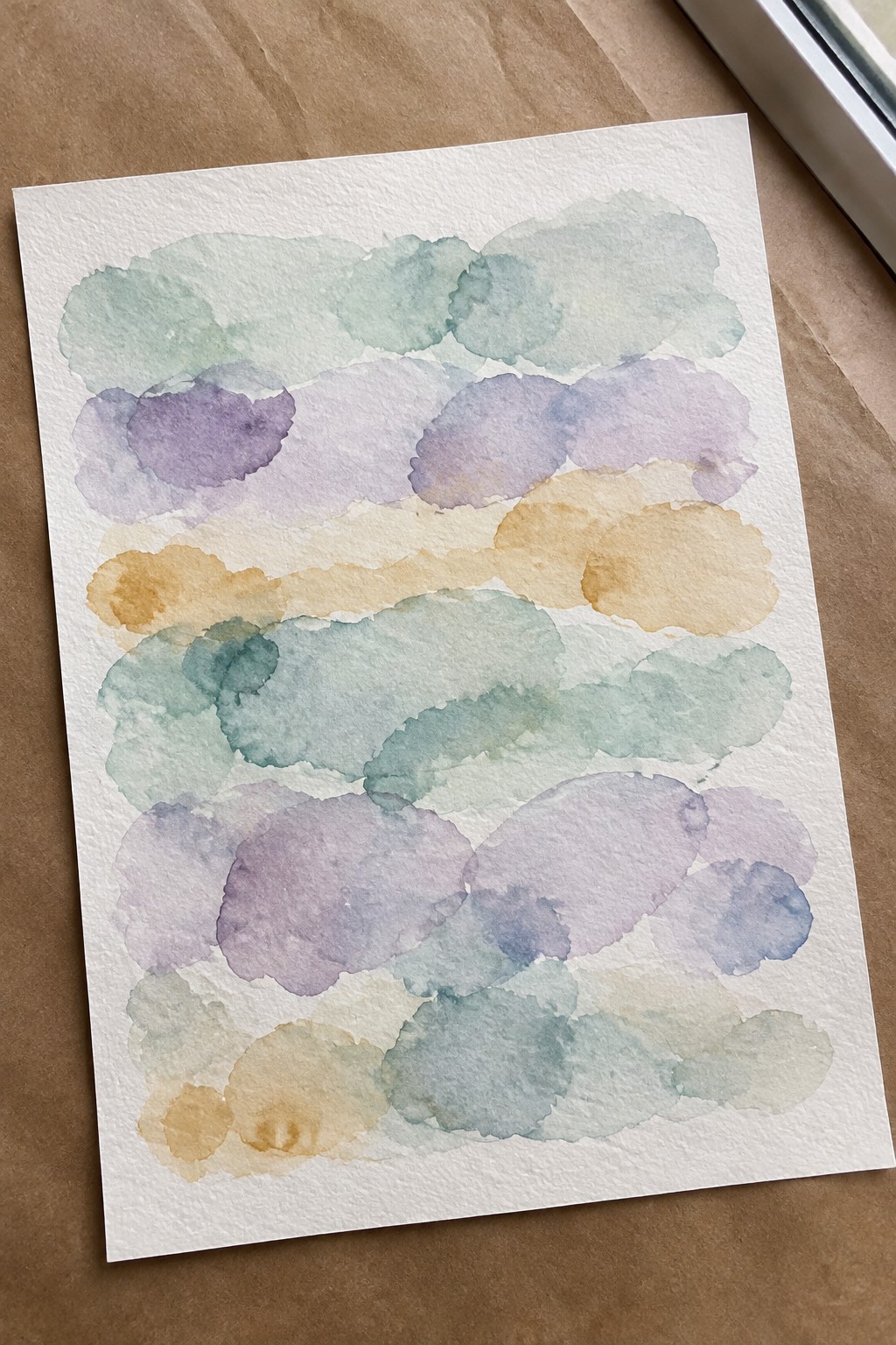
Overlapping watercolor shapes make an abstract painting idea built around soft edges, transparent layers, and a repeating horizontal rhythm. Muted greens, purples, and ochres keep the loose marks cohesive, while the plain paper background gives the composition room to breathe.
The repeated bands make this easy to adapt: use fewer rows, change the palette to match a room, or vary the shape sizes for a less orderly layout. It’s a useful way to practice layering and color mixing without sketching a detailed subject, and the finished piece can work as understated decorative wall art.
A Playful Grid of Color Blocks
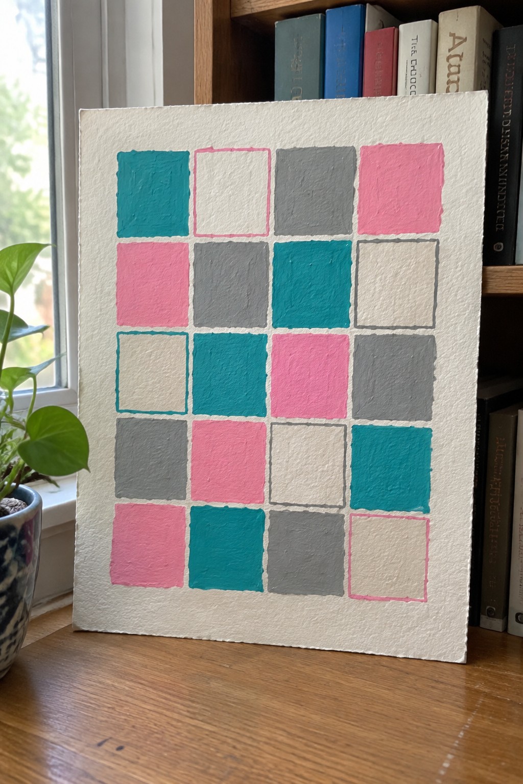
A loose grid of squares turns a small palette of teal, pink, gray, and white into a decorative abstract painting idea. Alternating solid blocks with outlined squares keeps the repeated shapes from feeling too uniform, while the textured white background lets the colors stand out.
The grid makes the layout easy to plan without sketching detailed subjects, and you can change the number of rows, square sizes, or colors to suit your space. For a simpler version, use fewer squares and one outline color; for a more personal piece, choose a palette that matches a room or make the blocks less evenly spaced.
Paint an Abstract Sunburst With Layered Circles

An abstract sunburst pairs a circular center with loose rings and uneven rays, making it a decorative geometric painting idea rather than a realistic sun. Warm ochre and coral set off the deep blue accents, while rough, layered brushstrokes keep the repeated shapes from looking too precise.
The circles and radiating lines give you a clear layout to start with, and the imperfect edges leave plenty of room to paint freely without a sketch. Change the palette to suit your room, simplify the rings, or vary the ray lengths; the bold, centered design also makes an eye-catching square piece for a Pinterest art board or a small wall display.
Diagonal Color Bands With Speckled Details

Broad diagonal bands in muted blue, olive green, terracotta, and cream make this a geometric abstract painting idea with a clear, easy-to-follow layout. A narrow cream stripe separates the blue and green sections, while small contrasting speckles add texture without competing with the large shapes.
The composition does much of the work, so you can focus on placing the bands and choosing a limited palette rather than drawing detailed subjects. Change the stripe widths, swap in colors that suit your room, or use fewer speckles for a cleaner look. This format also adapts easily to different canvas sizes, making it a practical idea for a coordinated set of decorative wall pieces.
Abstract Watercolor Shapes With Loose Black Lines

Build an abstract composition from overlapping, irregular color washes in muted blue, sage green, and warm rust, then add a few sweeping black lines and scattered dots. The soft-edged shapes create a loose vertical rhythm, while the darker marks give the decorative abstract painting structure and contrast.
The composition is easy to adapt because the color washes do not need precise outlines, and the black lines can be adjusted to suit the space you have. Try a smaller palette, simplify the linework, or shift the colors to match a room for a personal piece of wall art. The mix of soft color and graphic marks also makes a clear, distinctive idea to save for Pinterest.
Paint an Abstract Rainbow With Nested Arches

Nested arches and partial rainbow shapes make a decorative abstract painting built around repeated curves rather than a detailed subject. The warm ochre and rust bands stand out against deep teal and a textured cream ground, while overlapping arches give the composition depth.
The repeated curves make the layout easy to adapt: change the palette, vary the arch sizes, or leave more open background for a quieter design. You can paint fewer arches for a simpler version or use uneven edges and visible brush marks to make it feel more personal. Its bold shapes and clear color contrast also make it a strong idea for Pinterest-worthy wall art.
Abstract Crescent Moon Pattern

Repeated crescent shapes and loose diagonal brushstrokes create a decorative abstract painting with a playful, all-over composition. Coral, navy, yellow, and gray stand out against a pale layered background, while varied brush marks and a few paint drips keep the pattern from feeling too uniform.
The repeating shapes give you a clear starting point without requiring a sketch, and the loose background can cover small inconsistencies. Try limiting the palette to three colors, changing the crescent sizes, or leaving more open space for a simpler version. Its bold pattern and strong color contrast also make it easy to adapt as statement wall art or a Pinterest-friendly painting idea.
Softly Blended Abstract Watercolor Shapes

Build an abstract painting from loose, overlapping washes in muted green, dusty pink, and charcoal gray. The irregular horizontal shapes and soft color transitions create a layered composition that fits decorative abstract art without needing a recognizable subject or precise outlines.
The loose forms make this idea easy to adapt: change the palette, vary the size of the washes, or leave more white space between layers. For practice, focus on how wet and dry areas create different edges and textures; the tall stack of colors also makes a strong vertical print for a gallery wall or a Pinterest inspiration board.
Abstract Coastal Landscape With Bold Color Blocks

A coastal landscape is a useful starting point for abstract painting because cliffs, sea, distant hills, and small buildings can be reduced to broad, overlapping shapes. Here, muted blue water and hills contrast with rust-orange cliffs and dark green slopes, while thick, uneven strokes keep the scene loose rather than finely detailed.
The composition does much of the work: the sloping land leads the eye toward the shoreline, and the small pale houses give the larger color areas a sense of scale. To adapt it, simplify the buildings into a few light rectangles or change the palette to suit your room, then use expressive strokes to suggest the land and water without outlining every edge. That strong, readable layout also makes it a good subject for a landscape-inspired wall piece or a Pinterest painting idea.
Overlapping Circles in a Muted Color Palette

Build a decorative abstract painting from circles and partial circles in varied sizes, letting some shapes run off the edges of the canvas. Mustard yellow, dusty pink, teal, and gray stand out against a light background, while the overlapping forms add depth without requiring a detailed subject.
The simple geometry makes this a useful idea for practicing color balance, layering, and imperfect edges. Keep the palette as shown or swap in colors that suit a room, and vary the circle sizes to make the layout your own. The bold shapes and clear color contrasts also make the finished piece easy to read as a Pinterest thumbnail.
Abstract Cityscape With Layered Building Shapes

Build an abstract cityscape from overlapping blocks, using muted reds, olive green, cream, and pale blue to suggest buildings without drawing them in detail. Loose window marks and uneven, textured color give the geometric composition a hand-painted look, making it a decorative abstract idea rather than a precise architectural study.
The block shapes are easy to adjust, so you can simplify the buildings into a few rectangles or add more windows and layers for extra detail. Change the palette to match a room, or vary the building heights to make the layout your own. Its strong patches of color and recognizable city theme also make it easy to spot in a Pinterest collection of abstract painting ideas.
Rough Brushstrokes for a Teal, Ochre, and Blush Abstract

Broad, uneven bands of teal, ochre, blush, and charcoal make this a loose abstract painting idea built around layered color and contrast. Small groups of distressed circles break up the horizontal brushstrokes, while the cream background leaves the rough edges visible and gives the composition room to breathe.
The simple shapes make this idea easy to adapt without sketching: start with a few wide bands, then add circles or change their placement to suit your layout. Try a different palette or a smaller canvas for a more personal piece, or keep the strong color blocks for decorative wall art that stands out in a Pinterest feed.
Abstract Watercolor Stripes With a Sweeping Black Brushstroke

Vertical washes of teal, coral, gray, and muted beige create an abstract composition, crossed by a bold black curve that draws the eye diagonally across the page. The contrast between soft, textured color fields and the sharp, expressive line gives this decorative abstract painting its structure without relying on a detailed subject.
The composition does much of the work, so you can adapt it by changing the stripe widths, palette, or direction of the dark stroke. For a simpler version, paint a few uneven color bands and add one confident line once they dry. Its clear shapes and strong contrast also make it easy to crop or scale for a modern wall-art piece.
A Loose Checkerboard of Warm and Cool Colors

A hand-painted checkerboard turns a familiar grid into decorative abstract art, using navy, mustard yellow, rust, and cream in alternating blocks. The uneven edges and visible brush marks keep the geometric layout from feeling rigid, while the repeated colors tie the composition together.
The grid makes this idea easy to plan without a sketch: loosely divide the canvas into rows and columns, then vary the color order and leave some edges imperfect. Try a smaller canvas for a quick project, or adjust the palette to suit a room; the bold blocks and clear pattern also make the design easy to spot in a Pinterest feed.
Overlapping Loops and Watercolor Color Fields

Loose ochre loops weave across overlapping washes of sage green and dusty pink, creating a decorative abstract painting built from simple shapes and layered color. The irregular black grid marks add contrast and give the softer areas a bit of structure without taking over the composition.
The repeating loops make a useful starting point because they can be drawn freehand and arranged without planning a precise scene. Try changing the palette, varying the loop sizes, or leaving out the grid for a simpler version; the mix of bold outlines and soft color fields also makes a distinctive abstract print for a gallery wall.
Abstract Botanical Painting With Broad Leaf Shapes

A loose botanical abstract built from broad, petal-like leaves radiating from a central point makes a decorative painting idea without requiring realistic plant details. Muted greens, dusty pinks, and warm ochre stand out against a pale background, while the varied leaf sizes keep the radial layout from feeling too uniform.
The simple shapes make the composition easy to adapt: start with a few large leaves, then add smaller forms to fill the open spaces. Changing the palette or shifting the central point can make each version feel distinct, and the flat, poster-like layout suits a small canvas or a handmade wall-art gift.
Abstract Seascape With a Quiet Horizon

A loose abstract seascape uses a dark, uneven horizon line to divide pale water from a softly layered sky. Muted aqua, cream, and lavender brushstrokes, along with a few slender dark marks, give the landscape texture without relying on detailed scenery.
The strong horizontal layout makes this idea easy to adapt to different canvas sizes, and the colors can shift toward cooler blues or warmer sunset tones. Keep the distant shoreline as one simple dark band, then build the sky and water with broad, broken strokes for an abstract piece that can suit a quiet wall-art display.
Loose Watercolor Ovals in Muted Colors

Build an abstract painting from loosely painted oval and rounded shapes, letting them overlap in a scattered, all-over arrangement. Muted sage, dusty rose, ochre, and blue-gray keep the varied sizes and layered edges cohesive, while patches of speckled texture add contrast within the decorative composition.
The loose placement means you can change the number, scale, and overlap of the shapes without needing a planned sketch. Try limiting the palette to a few colors, or vary the texture by leaving some ovals smooth and adding speckles to others. The soft color mix and paper-like texture also make this idea easy to adapt into a coordinated set of wall prints.
A Textured Abstract With a Diagonal Cream Stripe

A broad cream stripe cuts diagonally through this abstract, separating loose blocks of olive green, rust, ochre, and blue. The palette and rough, layered brushwork make it a decorative geometric abstract without relying on precise shapes or a detailed subject.
The strong diagonal gives the composition a clear structure, while the uneven edges and visible texture leave plenty of room to work freely. Adjust the palette to suit your space, or simplify the design to a few large color fields and one contrasting stripe for an easy-to-personalize piece of wall art.
Loose Diagonal Brushstrokes on a White Background

Scattered, slanted brushstrokes turn simple blocks of pink, yellow, teal, and gray into a lively abstract painting. The white ground and varied spacing keep the decorative composition open, while the rough edges and occasional overlapping marks add texture without requiring a detailed subject.
The loose layout makes this a useful idea for practicing color combinations and brush pressure, since each mark can stand on its own. Keep the palette limited for a calmer look, or change the colors to suit a room; the small canvas format also makes it easy to adapt as a quick gift or a set of coordinating pieces.
Paint a Decorative Rainbow With Nested Arches

A nested rainbow makes a decorative abstract painting by stacking curved bands from largest to smallest, then varying their colors and adding simple dots or short stripes for detail. The warm terracotta, muted teal, peach, and ochre palette keeps the repeated shapes distinct while giving the composition a clear focal point.
The repeated arches provide a useful structure, so you can focus on choosing colors and filling each band rather than planning a complicated scene. Change the palette to suit a room, or simplify the pattern by leaving out the dots and stripes; a bold, centered rainbow also makes an easy-to-recognize idea for a Pinterest pin or a piece of wall art.
Textured Abstract Landscape With Teal and Blush

A loose abstract landscape takes shape through horizontal bands of deep teal, with broken vertical marks suggesting trees or other vegetation beneath a pale sky. Cream, ochre, and blush patches soften the darker areas, while rough, layered strokes give the composition a textured, natural feel.
The broad bands make this idea easy to adapt without drawing a precise scene first: start with a light sky and distant horizon, then build darker marks in the foreground. Change the palette to suit your room, or simplify the vegetation into a few clusters of vertical strokes. Its muted colors and landscape-like layout make it a strong reference for textured abstract wall art.
Torn-Paper Floral Shapes in a Color-Blocked Abstract

A decorative abstract painting can combine broad color fields with torn floral paper shapes for a layered, collage-like composition. Ochre, teal, blush pink, and cream create clear contrast, while small black marks and a simple leaf drawing add detail without taking focus from the larger shapes.
The torn edges and overlapping sections make this idea easy to adapt: change the palette, use scraps with a different floral pattern, or simplify the details to a few dots and lines. Its bold blocks and varied textures also give it a strong, recognizable look for a small canvas or a Pinterest-worthy wall art piece.
Frequently Asked Questions
Yes. Abstract painting is a great fit for working directly on the canvas because there’s no need to draw recognizable objects. Start with a loose plan, such as a color palette, a few shapes, or a mood you want to capture. Then build the painting in layers, adjusting as you go. If you feel stuck, make a few small marks and let them suggest what to add next.
You can begin with a canvas or sturdy paper, paint, brushes, and water for rinsing brushes. Acrylic paint is especially beginner-friendly because it dries quickly and works on many surfaces. For more varied marks, try palette knives, sponges, old cards, cotton swabs, or even your fingers. You do not need every tool on hand. A few colors and one or two tools are enough to get started.
Pick colors before you paint, then use them as a simple guide. You might choose two or three colors that sit close together, such as blue, teal, and green, or combine one bold color with neutrals. To keep the painting cohesive, repeat each color in several places. You can also test your palette on scrap paper first, but it’s fine to change direction once you see the colors on the canvas.
Keep going before deciding it has failed. Add another layer, soften a busy area with a larger brush, or cover part of the painting with a new color. Abstract art can change dramatically as it develops. If the paint is still wet, you can blend or move it around; if it’s dry, paint over it. Taking a short break can also help you see what the piece needs.
A painting may be finished when the colors and marks feel balanced and each area has a purpose. Step back and look for places that seem too empty, too crowded, or disconnected. You can add a few final details, but avoid making changes just to fill every space. If you’re unsure, leave the painting for a while and return to it with fresh eyes.
