

I often turn to mini canvases when I want to paint without setting up a big workspace.
Abstract ideas work especially well on them since they leave room for loose shapes and quick color choices.
I have tried out different approaches over time and found a few that feel simple enough to finish in one sitting.
These usually involve basic marks or layers that still hold together even when the surface is small.
They make it easy to keep painting regularly without much pressure.
Stacked Curved Shapes in Three Tones

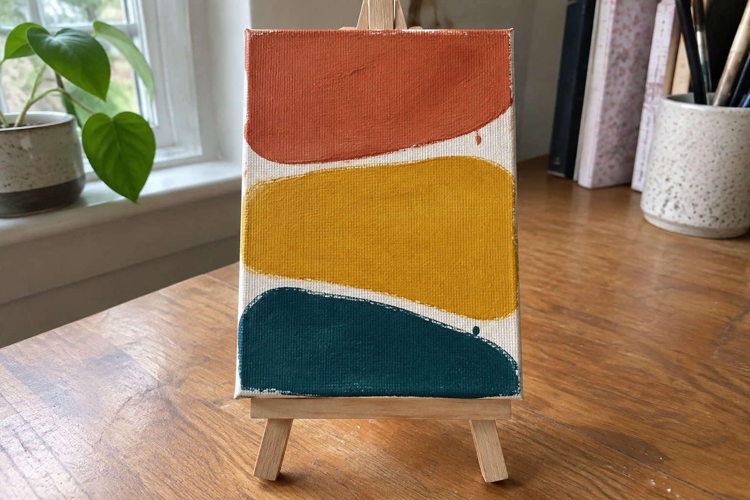
This abstract idea uses three bold color blocks stacked on a neutral background, each with soft irregular edges and a single paint drip. The top shape sits in a warm orange, the middle in a mustard yellow, and the bottom in a deep teal, all painted with visible brush marks that add texture without extra detail. The simple horizontal layout keeps the focus on color contrast and shape variation rather than precise forms.
What makes this idea useful is how easily the shapes can be adjusted on a small canvas without needing perfect symmetry. The limited palette works well for quick practice sessions or matching existing room colors by swapping the three hues. For wall art, the clean composition stands out on Pinterest because the drips and curved edges give it movement while staying minimal enough to finish in one sitting. You can simplify it further by removing the drips or make it your own by changing the order of the colors.
Abstract Crescent Moons with Scattered Dots
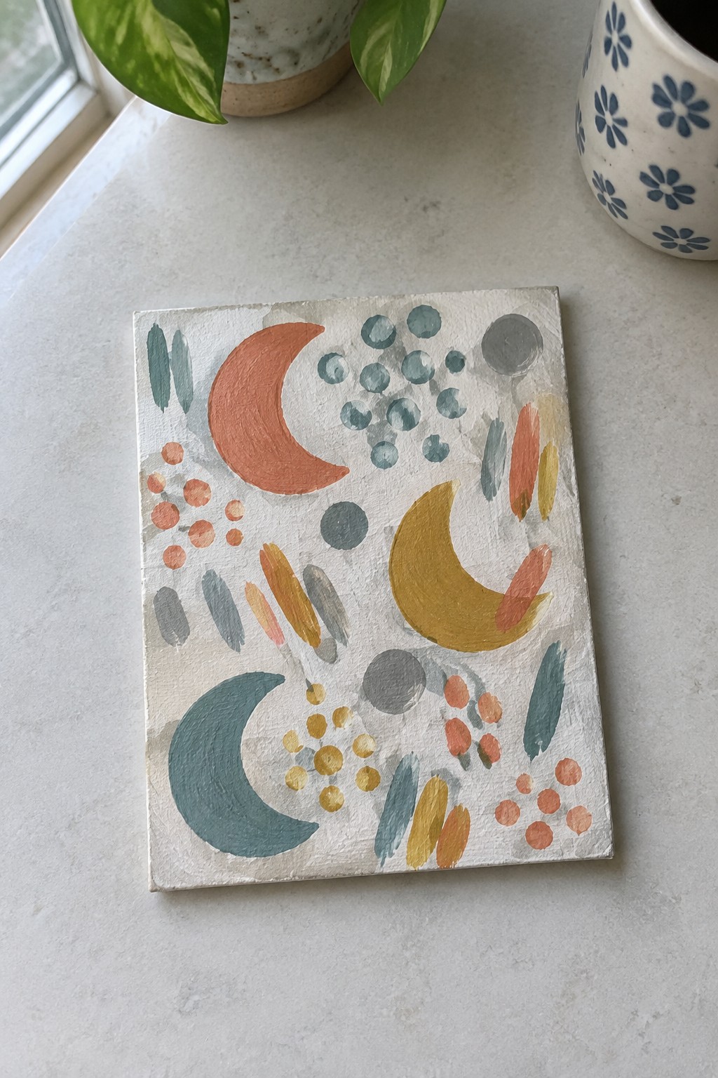
This idea uses repeated crescent shapes in different sizes and colors as the main focus, surrounded by small dot clusters and short brush marks. The arrangement spreads these elements across a light background so the curved forms and round accents create movement without filling every space. A limited palette of terracotta, teal, mustard, and gray keeps the shapes connected while the off-white surface prevents the design from feeling heavy.
The composition does a lot of the work here because the moons and dots already provide built-in contrast in both shape and scale. You can easily adapt the idea by changing the color order, shrinking the moons further, or spreading fewer dots across a larger mini canvas. For practice, this kind of subject works well since the loose shapes forgive uneven edges and let you test color combinations quickly.
Concentric Color Rings with Radial Brushwork

Painting a series of concentric circles that expand from the center outward creates an abstract composition built entirely on color shifts and ring spacing. The idea works by layering warm tones in the middle that gradually transition to cooler shades toward the edges, with visible brushstrokes giving each ring its own texture and slight irregularity. This approach stays simple in structure while the radial layout keeps the eye moving across the small square surface.
What makes this idea useful is how the circular format fits a mini canvas without requiring straight lines or complex perspective. You can change the color order or add more rings to match different palettes, and the same layout works whether you keep the strokes loose or smooth them out. For practice, this kind of subject lets you focus on blending and building layers while the strong center point holds the whole piece together. The bold color contrast also helps it stand out in photos for mood boards or project shares.
Diagonal Abstract Landscape in Muted Greens and Blues
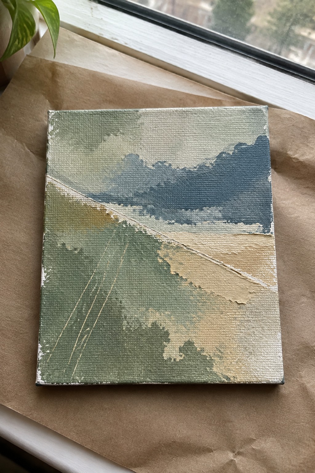
An abstract landscape idea built around a strong diagonal line that divides cooler mountain shapes from warmer foreground fields. The composition uses soft color blending across greens, blues, and earth tones to create depth without hard outlines. Thin gold lines add subtle texture and direction through the lower section while keeping the overall feel loose and open.
What makes this idea useful is the diagonal split that gives structure while leaving plenty of room for color changes. You can shift the palette toward cooler tones for a winter version or warmer shades for a dry landscape look. The same layout works well for quick studies or as part of a small series where each piece uses a different mix of greens and blues.
Mini Canvas Grid of Abstract Symbols
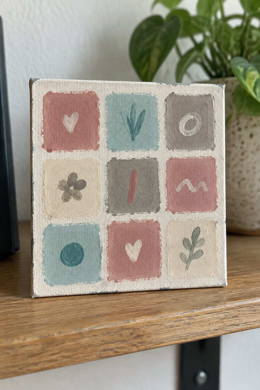
A 3×3 grid of small abstract symbols works well as a painting idea because it turns simple marks into a complete composition. Each square holds one basic shape such as a heart, leaf, flower, or wavy line painted in a soft palette of dusty rose, sage green, and warm gray. The even layout and limited color range keep the piece balanced while the variety of marks prevents it from feeling repetitive.
What makes this idea useful is that the symbols can be swapped for anything you want to practice, like letters, dates, or favorite objects. The square format helps with spacing and makes color mixing easier since each section stays small. For wall art or gifts, the grid structure gives it a finished look without requiring advanced detail work. You can change the background tone or shift the palette to match a room without redesigning the whole layout.
Horizontal Seascape with Crescent Accent
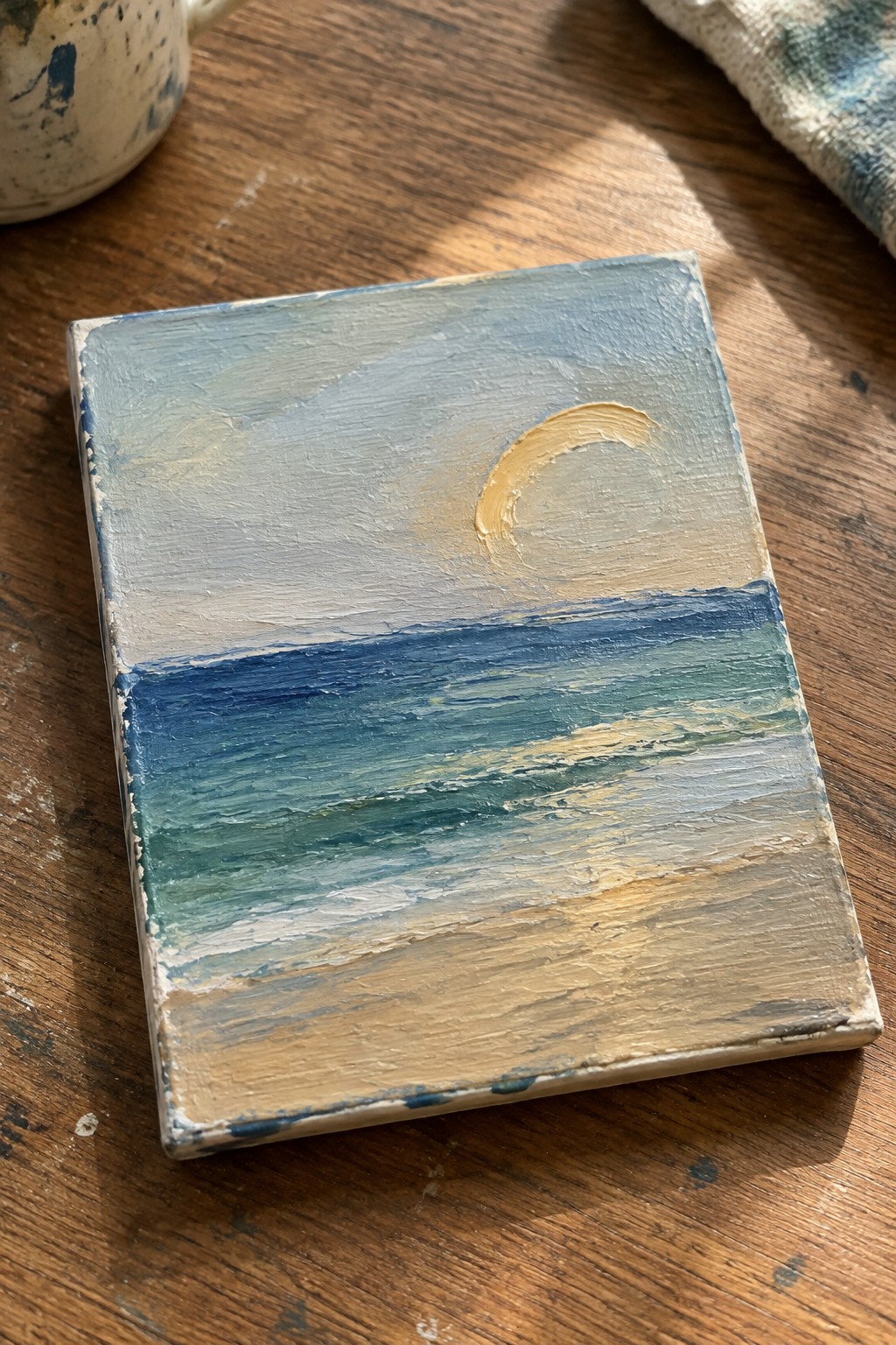
A seascape built from three stacked bands gives a mini canvas clear structure without extra planning. The top section uses soft sky tones, the middle holds the water with overlapping strokes to show movement, and the bottom band forms the shore in warmer neutrals. Placing a single crescent shape in the upper area creates a focal point while keeping the rest of the surface simple.
What makes this idea useful is how the straight divisions do most of the layout work for you. You can change the palette to match a sunrise, keep the same bands for a different location, or swap the crescent for a sun or nothing at all. The approach also scales easily if you want to test color mixes or brush pressure before moving to a bigger canvas.
Striped and Dotted Abstract Mini Canvases
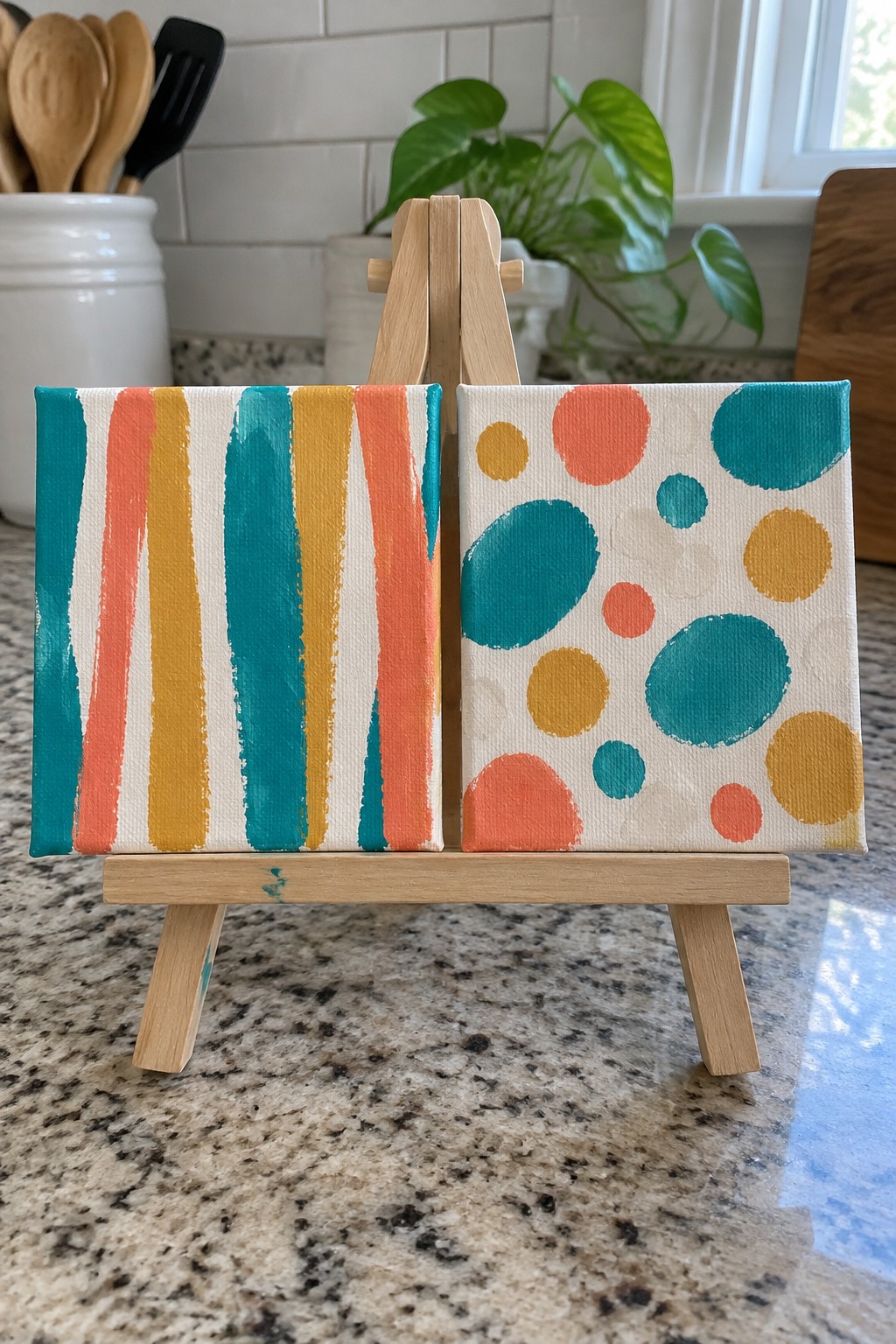
This painting idea pairs vertical stripes in teal, coral, and mustard yellow on one canvas with scattered circles in matching colors on the other. The stripes run unevenly with visible brush texture while the circles vary in size and overlap slightly to fill the space. The shared palette and simple geometric shapes make the two canvases read as a coordinated set without any added detail or shading.
The composition does a lot of the work here because the contrasting patterns still feel connected through color. You can adapt this by flipping the stripes to horizontal or clustering the dots more tightly on one side. For wall art, something like this works especially well as a small diptych over a shelf or desk where the mini size keeps it from dominating the surface. The same idea could be simplified further by using just two colors or made more personal by swapping in your own palette.
Overlapping Abstract Florals
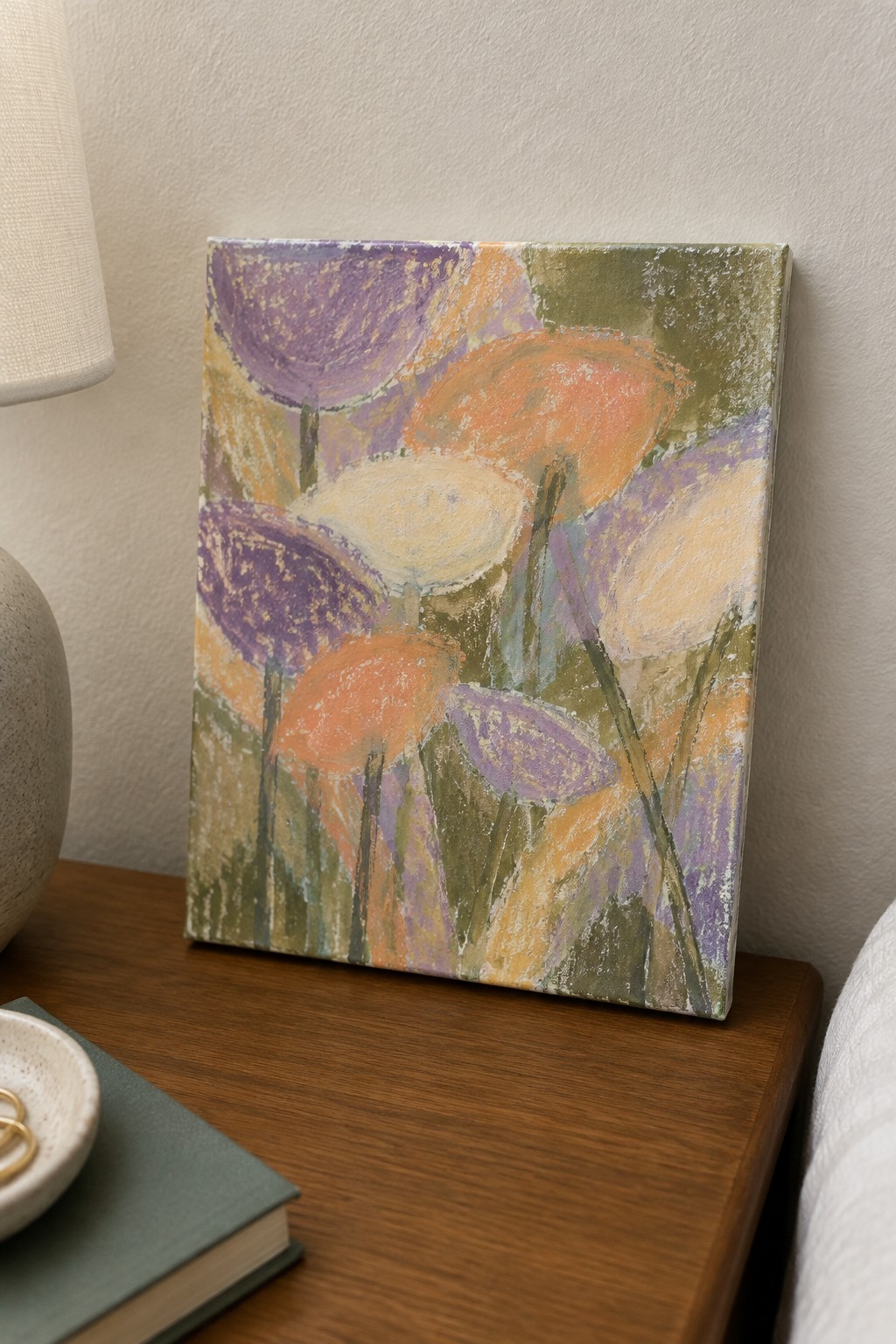
This painting idea centers on building a loose floral arrangement from overlapping rounded shapes in different sizes. The shapes sit at varying heights with thin vertical strokes suggesting stems, which keeps the whole thing from looking flat. It works as an abstract floral because the focus stays on color blocks and texture rather than outlines or realistic petals.
What makes this idea useful is how simple it is to change the palette or shift the placement of the shapes for a new result. The soft edges and mixed colors prevent it from feeling too stiff on a small canvas. You could try it with just two colors if you want something quicker, or add a few more layers of paint for extra texture. For practice, this kind of subject helps you work on composition without needing to draw anything precise.
Loose Grid Abstract in Earthy Blocks

An abstract grid of uneven squares and rectangles painted in muted navy, terracotta, sage, and beige creates a balanced pattern that fills a mini canvas without needing precise lines. The idea relies on visible brushstrokes and slight color shifts inside each block to build texture while keeping the overall layout simple. This approach belongs to abstract decorative art where color placement and shape arrangement do most of the visual work.
What makes this idea useful is how the grid structure guides placement so you can focus on mixing and testing colors instead of planning a scene. You can change the palette to match a room or swap in cooler tones for a different season while keeping the same block layout. The format also adapts easily to different canvas sizes since the uneven spacing prevents it from looking too rigid. For practice pieces or quick decor, the small scale lets you finish one in a single session and still get a finished result worth displaying.
Overlapping Muted Circles for Abstract Mini Paintings
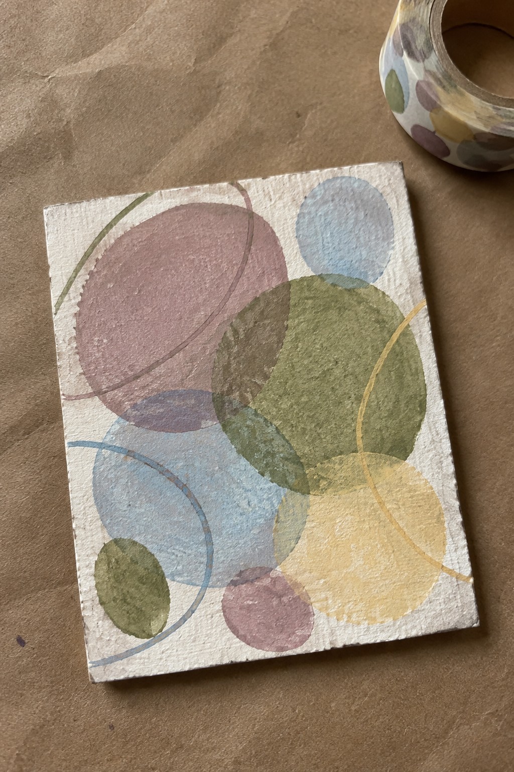
This idea uses clusters of overlapping circles in a soft, desaturated palette to create a simple geometric abstract. The circles sit at different sizes and opacities so some colors blend where they cross while others stay distinct, and a few thin curved lines run through the arrangement to connect the shapes. The result is a balanced composition that relies on color layering and negative space rather than detail or realism.
What makes this idea useful is how forgiving the loose circle shapes are when you work on a small canvas. You can shift the placement or change which colors sit on top without ruining the overall look, and the muted palette keeps it easy to match with different decor styles. For practice, this kind of subject helps you focus on edge control and color mixing while still finishing a complete piece quickly. The same layout works just as well if you swap in bolder colors or simplify it to three circles total.
Terracotta and Teal Mosaic Abstract
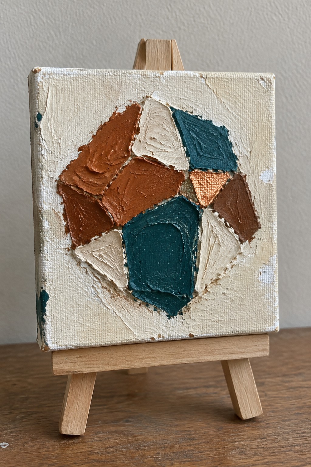
This painting idea uses chunky, irregular shapes in warm terracotta, deep teal, beige, and a small metallic copper accent arranged in a loose cluster. The shapes sit against a plain cream background with visible brushstrokes and slight texture buildup that gives each section its own weight. The composition works because the colors alternate between warm and cool tones, which keeps the eye moving across the canvas without needing perfect symmetry.
What makes this idea useful is how the neutral background does most of the layout work, so you only need to focus on placing a handful of shapes. The same structure adapts easily by swapping in different color families or adding more metallic touches. For mini canvases, this approach stays quick to paint while still looking deliberate on a shelf or desk.
Vibrant Swirling Abstract for Mini Canvases
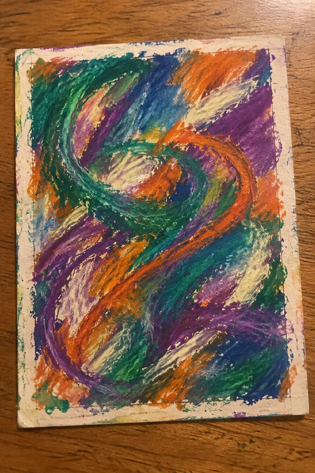
An abstract idea built around overlapping curved strokes that create continuous movement across the canvas. Thick directional brushwork in orange, teal, purple, and blue builds layers while leaving some white space to keep the composition from feeling crowded. The result is a loose, energetic piece that relies on color contrast and flow rather than any defined subject.
What makes this idea useful is how easily the same swirl pattern can be adjusted by changing the color order or stroke width. The overlapping curves fill the small canvas quickly without requiring careful planning, making it a good option for quick practice sessions. The color mix can be swapped for cooler tones or earth colors depending on the season or room it is meant for.
Bold Circle with Thin Line Accents
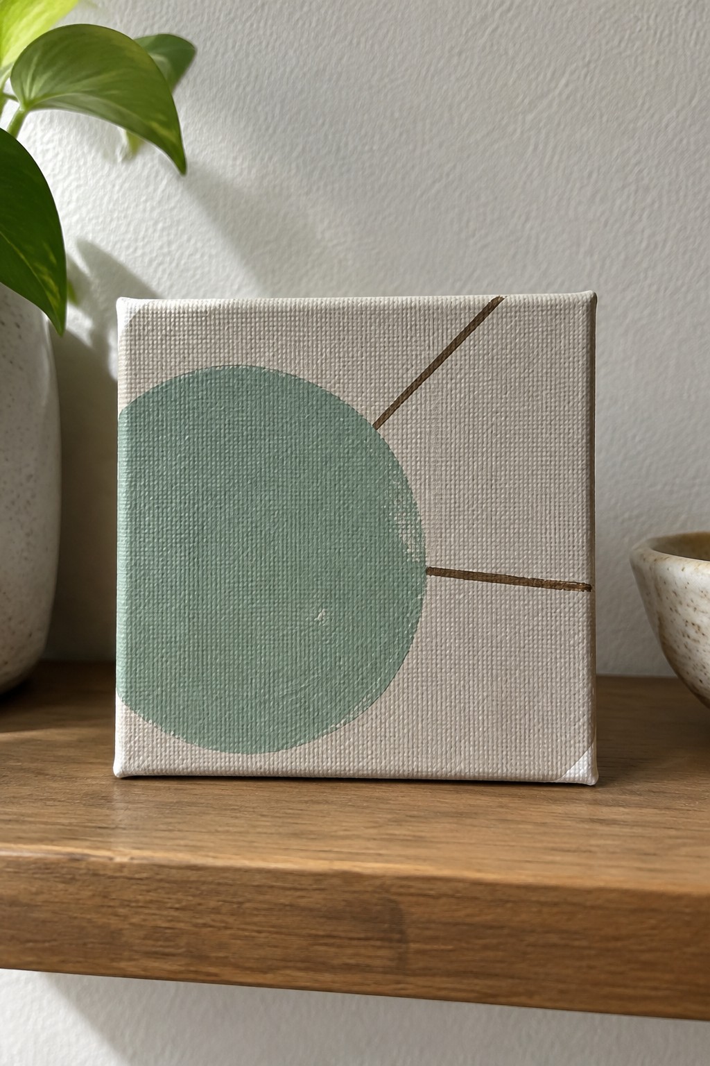
A single large circle placed off-center on a light background creates the main focus in this abstract idea, while two narrow lines cut across the remaining space to add direction and structure. The contrast between the solid shape and the delicate lines keeps the composition balanced without adding extra elements or layers. This approach works as a straightforward abstract design that relies on shape placement and negative space rather than color blending or detail work.
What makes this idea useful is how the limited elements let you adjust the circle size or line angles to fit different canvas proportions. You can change the circle color or background tone to match existing decor, or simplify it further by using just one line if you want even less to manage. For mini canvases, the design fills the surface quickly while still leaving room for personal color choices.
Horizontal Color Band Abstract
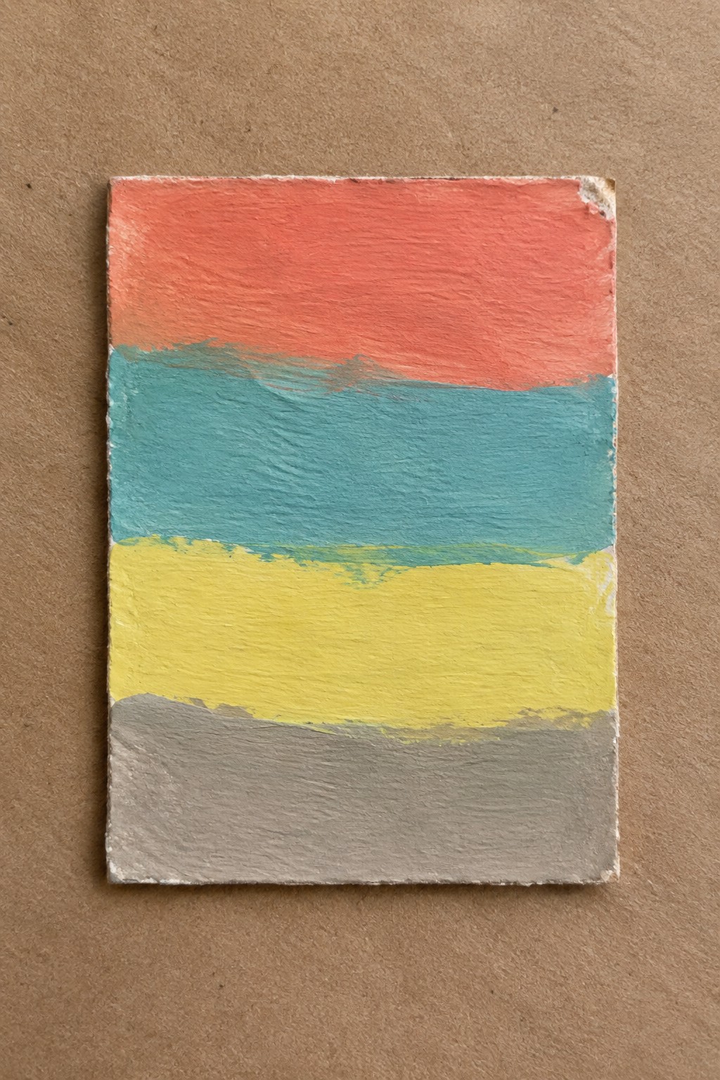
Horizontal bands of color create a clean abstract idea that fits mini canvases well. The four stripes use contrasting temperatures—warm coral at the top, followed by cool teal, bright yellow, and a grounded gray—to keep the eye moving without any complex shapes. Visible brushstrokes add texture that prevents the flat areas from feeling empty while the uneven edges between bands give the piece a handmade quality.
The composition does a lot of the work here by using simple divisions instead of detailed subjects. Swapping the colors for different combinations makes this easy to match any room or season. For practice, this kind of subject helps with color mixing and keeping edges straight on a small surface. The same idea could be adapted by changing band widths or letting one color bleed slightly into the next for a softer look.
Dynamic Diagonal Strokes in Contrasting Colors
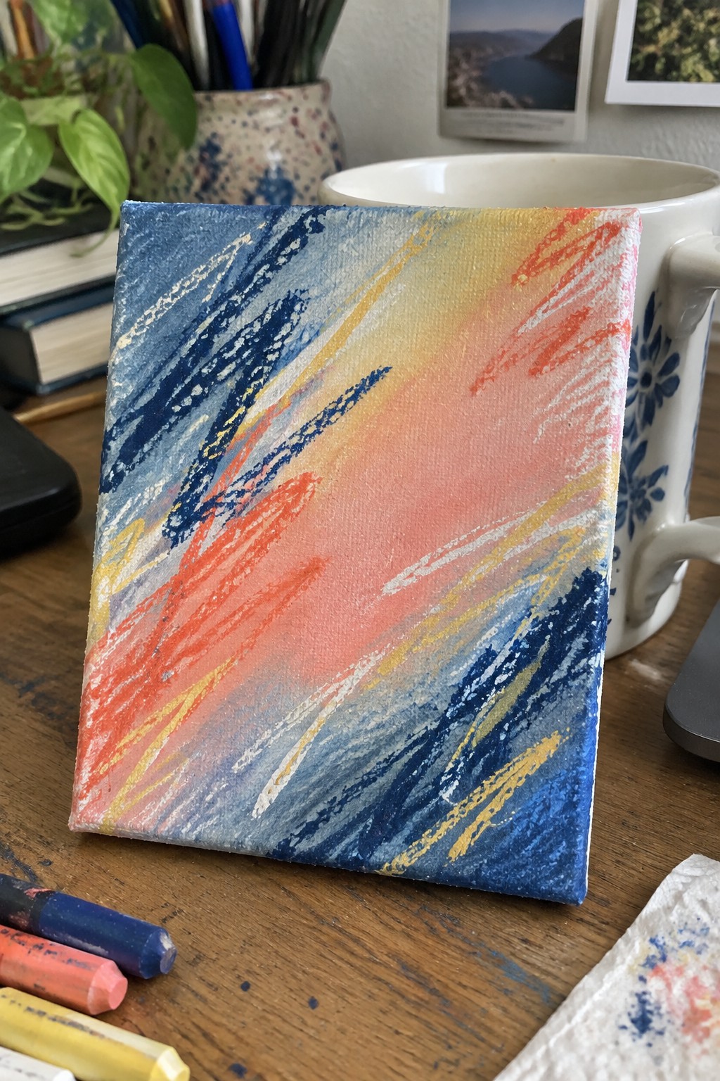
An abstract approach that relies on bold diagonal strokes layered across a small canvas in cool blues and warm oranges with yellow accents. The directional lines create movement while the overlapping colors form a loose center blend without needing precise shapes or details. This idea fits the abstract category and works because the strong angle choice and color temperature contrast carry the composition on a limited surface.
What makes this idea useful is how the same stroke direction can be repeated with different color pairs to shift the mood quickly. The layout stays effective even if the canvas size changes slightly or the strokes get thicker. For practice, this kind of piece helps test color mixing and line variation without planning a full subject. The background stays minimal so the focus stays on the stroke work itself.
Stacked Ovals in Earthy Neutrals

This abstract idea uses five horizontal ovals stacked vertically to create a simple repeating pattern. The ovals alternate between light beige and dark brown against a blended gray-brown background, with the horizontal shapes giving the composition a steady rhythm across the small canvas. Visible brushstrokes and slightly rough edges keep the forms from looking too precise.
What makes this idea useful is how the basic oval shapes and limited palette let you finish a piece quickly on a mini canvas. You can swap the neutrals for any two colors you already have or adjust the number of ovals if the canvas size changes. For practice, this kind of painting helps you work on even coverage and soft blending without needing fine details. The balanced layout also translates well to a small decorative accent for a shelf or desk.
Abstract Shapes Linked by Dashed Lines
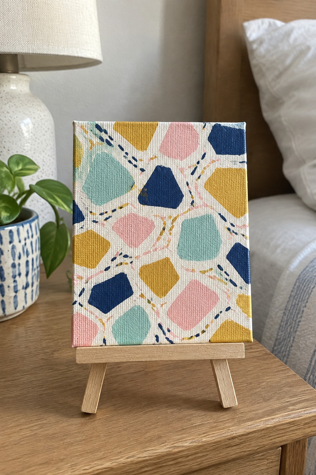
This painting idea centers on irregular polygons in soft yellow, pink, blue, and teal scattered across a light background and joined by broken dashed lines in darker tones. The overlapping forms and varied sizes create visual movement while the white space prevents the design from feeling heavy. It belongs to abstract decorative art that suits mini canvases because the shapes stay simple and the lines add structure without demanding precision.
What makes this idea useful is how quickly you can change the color mix or reduce the number of shapes to fit whatever palette you already have. The dashed lines give the composition interest even if your edges stay loose, which helps the piece look finished faster on a small surface. For practice, this kind of subject works well when you want to experiment with balance and color placement without committing to a full scene.
Earth Tone Abstract with Loose Marks and a Circle
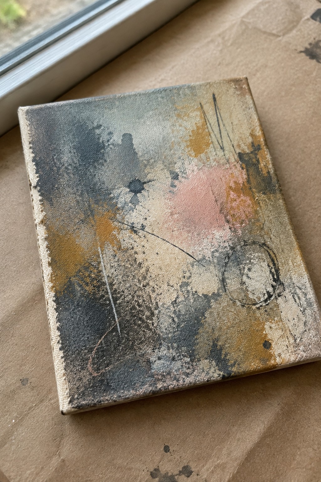
This painting idea centers on building an abstract surface through layered washes of gray, ochre, and muted pink, then adding simple linear marks and one open circle to create visual movement. The composition works by letting darker, heavier areas sit on one side while lighter space and a single curved line balance the other, keeping the eye moving across the small canvas. It belongs to the loose abstract category where texture from splatters and brushwork matters more than any clear subject.
What makes this idea useful is how the neutral palette adapts quickly to different wall colors or room styles without needing new supplies. You can swap the pink for another accent or drop the circle entirely if you want a simpler version for practice. The background texture does a lot of the work here, so beginners can focus on layering colors first and add lines later. For wall art on mini canvases, this approach stands out on Pinterest because it looks finished without requiring tight detail.
Frequently Asked Questions
What basic supplies do I need to create abstract paintings on mini canvases?
You will want a set of small canvases around 4 by 4 inches or 5 by 5 inches, acrylic paints in a variety of colors, fine detail brushes, a palette for mixing, and perhaps some palette knives for texture. Add water for thinning, paper towels for cleaning, and an optional varnish for protection once the work is dry. These items keep the process simple and portable while allowing plenty of room for experimentation with the ideas.
Which painting techniques suit abstract work on such small surfaces best?
Dripping, splattering, and layering thin washes work especially well because they add interest without requiring large areas. Stippling with a stiff brush or using the edge of a credit card to scrape lines can also create dynamic marks in limited space. Keep layers light at first so colors stay vibrant and the composition does not become muddy.
How do I choose colors that remain balanced on a tiny canvas?
Start with a limited palette of three to five colors plus white for tinting. Place the darkest and lightest tones first to establish contrast, then fill in mid tones. Step back frequently while working to check how the colors interact from a normal viewing distance. This prevents any single hue from dominating the small area.
What are good ways to add texture without making a mini painting look cluttered?
Use modeling paste or thick gel medium in small amounts to build raised areas, then paint over them once dry. Incorporate collage elements such as torn paper or fabric scraps sparingly. Focus texture in one or two focal spots and leave other regions smoother so the eye has places to rest.
How should I display or store finished mini abstract paintings?
Attach a small sawtooth hanger on the back or prop them on tiny easels for shelves. For protection, apply a matte or gloss varnish after the paint cures. Store them upright in a dust free box with acid free tissue between pieces if you are not displaying them right away.
