


I have been working on some abstract paintings to hang in my living room.
Getting them to coordinate can make the whole room feel more put together.
I put together a list of ideas that have worked for me in different ways.
Some use soft colors while others play with shapes and lines.
You might find something here that suits your own space.
Loose Grid Abstract with Warm and Cool Color Blocks

This abstract idea breaks a canvas into uneven rectangles and fills them with a mix of warm oranges, yellows, and cooler teal tones against neutral backgrounds. The blocks sit at slightly different angles with visible brushstrokes, which stops the grid from looking stiff or mechanical. The contrast between the earthy warms and muted teals creates balance while keeping the overall design simple enough to finish in one or two sessions.
What makes this idea useful is how quickly you can swap the colors to fit your room without changing the layout. You could start with just four or five blocks on a smaller canvas to test the arrangement, then repeat the same structure at a larger size once the colors feel right. The irregular spacing also makes it forgiving if your edges aren’t perfectly straight, which helps when you want a finished piece without spending hours on precision.
Layered Horizon Abstracts

This idea uses broad horizontal bands of color to suggest a landscape without any defined shapes or outlines. Soft washes overlap and bleed into each other, creating a simple sky-over-hills effect through color placement alone. The approach sits firmly in the abstract landscape category and relies on the natural movement of the paint to build depth.
The composition does a lot of the work here because the eye reads the bands as distance even though nothing is clearly drawn. You can easily adapt it by swapping the current pink and blue tones for colors that match your living room or by stretching the same layout across a wider canvas. For practice, this kind of subject helps you focus on paint control and edge blending without worrying about drawing skills.
Stacked Geometric Shapes Abstract

This painting idea uses a vertical stack of overlapping circles and crescents to create a balanced tower of forms. The shapes vary in size and color while staying centered, with one section using a dotted pattern to break up the solid blocks. The limited palette of navy, teal, coral, and beige keeps the focus on the arrangement rather than on detail.
What makes this idea useful is how the basic shapes can be cut from paper for tracing or painted freehand without needing perfect edges. You could swap the coral circle for a different accent color to match your existing room or replace the dots with simple lines if you want less texture. For wall art, something like this works especially well in a narrow space because the vertical layout fills height without spreading wide. The plain background makes it easy to adapt the same idea to different color schemes or canvas sizes.
Bold Sunset Horizon with Layered Color Bands
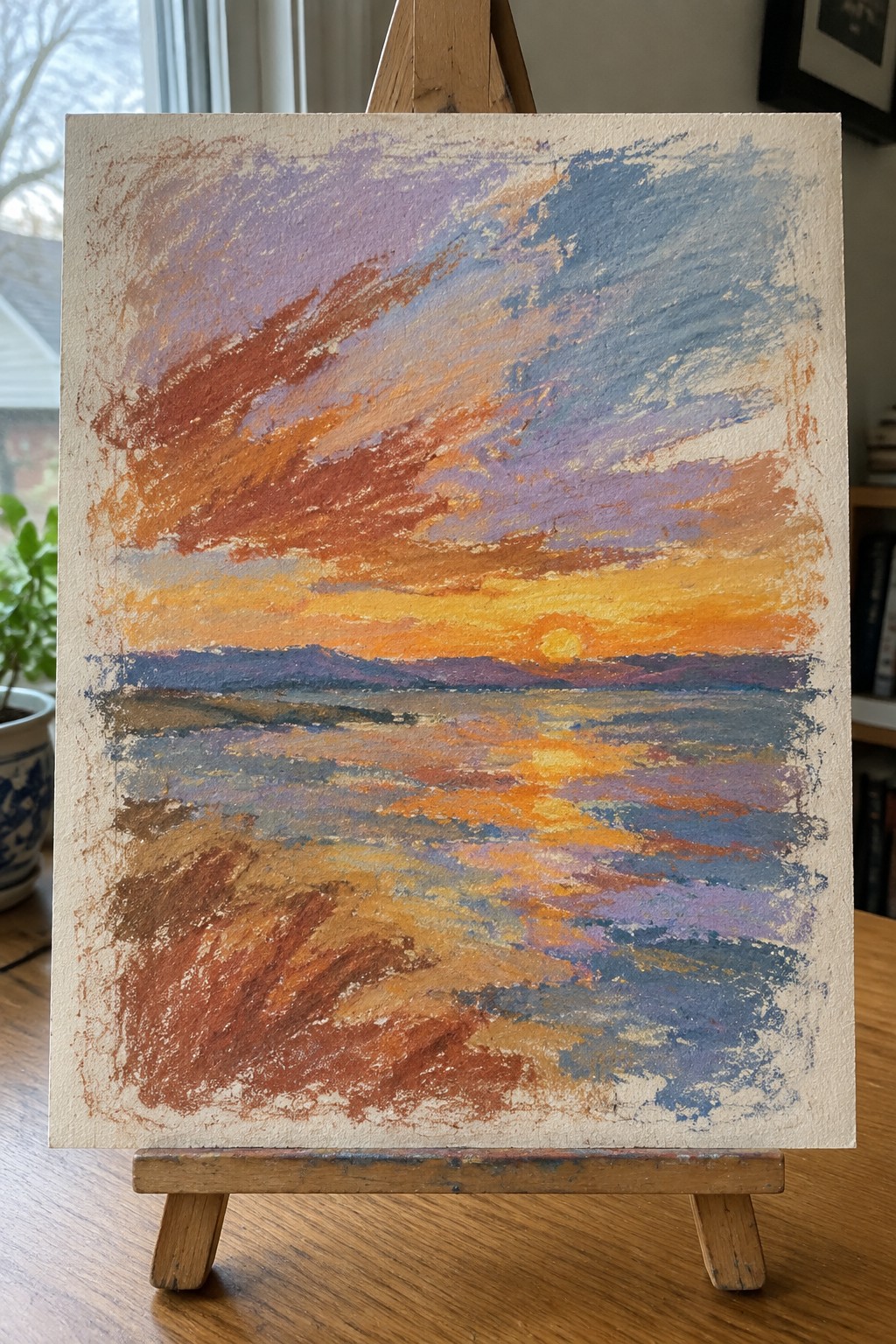
A sunset landscape idea works well when you keep the focus on horizontal color bands that move from warm oranges and yellows near the sun down into cooler blues and purples. The composition stays effective because the simple horizon line and loose directional strokes create depth without needing detailed shapes or realistic forms. This approach fits the abstract landscape category where color blending and visible brushwork do most of the visual work.
The color palette makes this easy to adapt by shifting the balance toward more reds or cooler tones depending on the room. What makes this idea useful is how the strong horizontal layout lets you practice color mixing and texture on a single canvas without getting stuck on small details. For wall displays this kind of piece holds up in a group because the broad strokes and reflected light keep the eye moving across the surface.
Layered Mountain Triptych in Muted Earth Tones
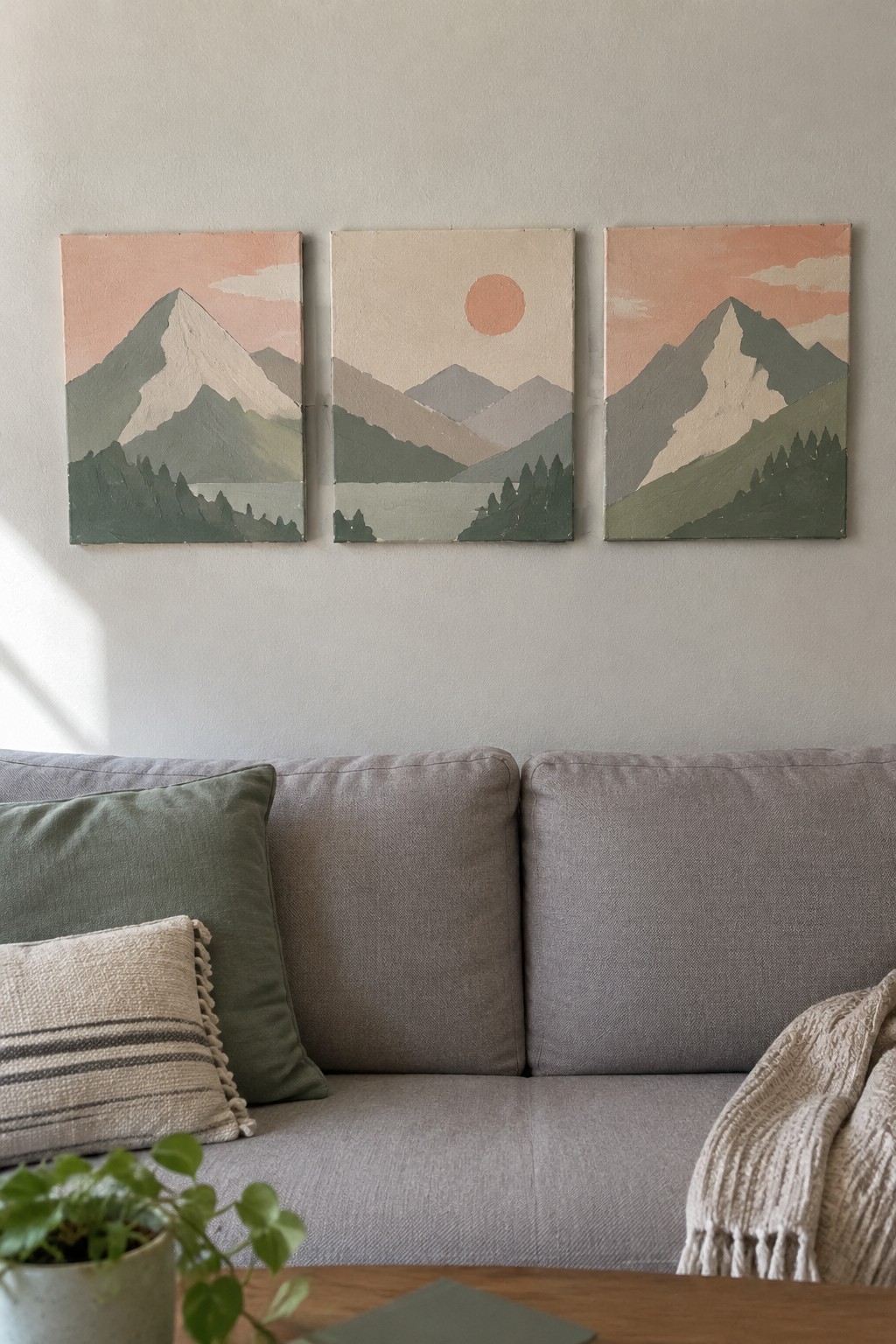
A triptych of simplified mountain landscapes uses stacked flat shapes in sage green, warm beige, and soft peach to create a wide horizontal scene across three separate canvases. One panel places a solid circle sun in the center to give the set a clear focal point while the other two balance the composition with overlapping ridges and tree clusters at the base. This landscape approach relies on color repetition and even spacing rather than fine detail to make the panels read as one connected piece when hung together.
What makes this idea useful is how the repeating palette lets you adjust the tones to match existing furniture or wall color without repainting everything. The simple mountain silhouettes work at different sizes, so the same layout can be scaled down for smaller walls or stretched wider with extra panels. For wall art, something like this stands out on Pinterest because the coordinated look feels intentional and finished even when the shapes stay basic.
Abstract Collage with Earthy Shapes and Gold Touches
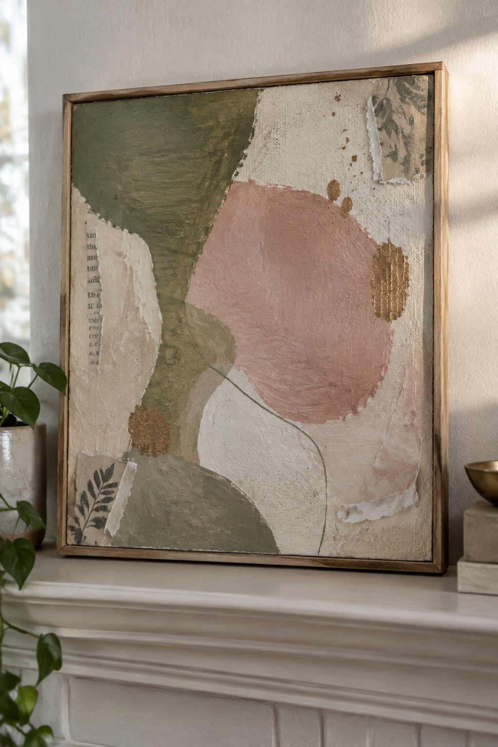
This idea uses large overlapping color areas in muted green, dusty pink, and off-white to build an abstract composition without a clear focal point. Torn paper scraps with botanical prints and bits of text add texture and break up the painted sections, while small gold marks create contrast against the soft palette. The approach sits in the decorative abstract category, where the interest comes from layering shapes and surface details rather than any specific subject or scene.
The composition does a lot of the work here because the big shapes stay easy to copy even if your brushwork is loose. You can swap the pink for another color that matches your room or use whatever paper scraps you already have for the collage pieces. This kind of piece works especially well for wall art because the neutral palette fits most living room setups and the added gold keeps it from looking too plain. Scaling it down to a smaller canvas or simplifying the collage to just two or three pieces makes it quicker to finish for practice or gifts.
Abstract Drip Composition in Teal and Yellow

An abstract idea centered on loose watercolor washes paired with ink drips and splatters creates a strong option for living room walls. The composition balances soft blended areas of teal and yellow against heavier black marks and vertical drips that add direction without filling the whole space. This keeps the piece feeling open while still giving enough visual weight to hold attention on a large wall.
What makes this idea useful is how simple it is to adjust the color mix to fit a room’s existing palette. You could reduce the number of drips for a cleaner look or repeat similar vertical marks across two or three smaller canvases for a set. The contrast between the light washes and dark ink helps the work stand out even on busy gallery walls.
Symmetrical Teardrop Stack with Leaf Borders
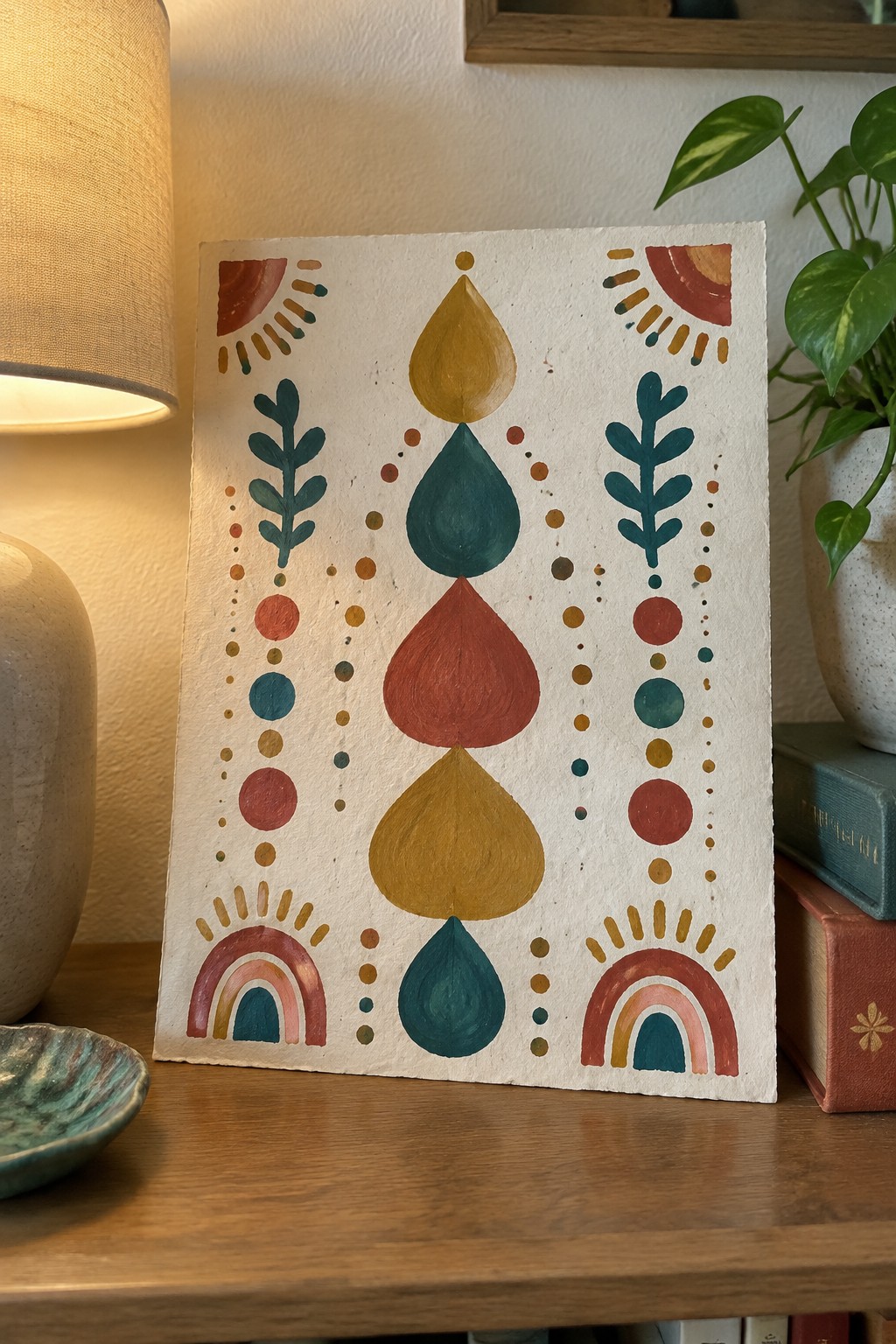
A vertical stack of overlapping teardrop shapes in mustard, teal, rust, and gold forms the core of this abstract idea. Flanking lines of simple leaf silhouettes and scattered dots create side borders, while small rainbow and sunburst shapes sit at the top and bottom corners. The limited color palette and mirrored layout make it a clean decorative abstract piece that works for coordinated wall displays.
The composition does a lot of the work here because the central stack keeps everything organized while the side elements add rhythm without crowding the space. You could swap the colors to match existing room tones or repeat the same layout on different sized canvases for a set. This would be easy to turn into a series by changing just the teardrop shades or simplifying the dots into single lines. For wall art, the balanced structure helps it photograph well for Pinterest without needing extra props.
Overlapping Arches in Warm Earth Tones
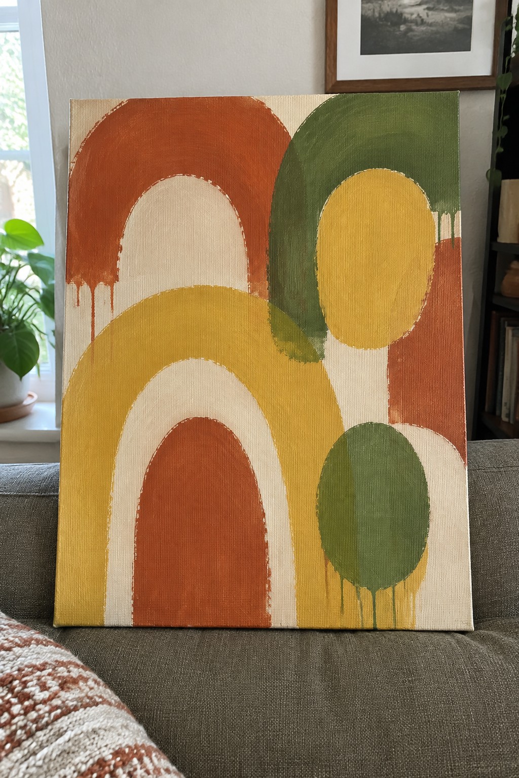
This idea uses stacked and overlapping rounded arches and ovals to build an abstract composition. The shapes are arranged so larger forms sit behind smaller ones, creating depth without needing perspective or shading. A restricted palette of terracotta, mustard, olive, and cream keeps the focus on the arrangement rather than on color mixing.
The composition does a lot of the work here because the overlapping shapes naturally create interest and balance. You can adapt the same layout to match your room by swapping in colors that already appear in your furniture or textiles. The drip details are optional and easy to add or skip depending on the look you want. This type of painting works well for larger wall pieces since the bold forms read clearly from a distance.
Layered Coastal Landscapes in Muted Tones
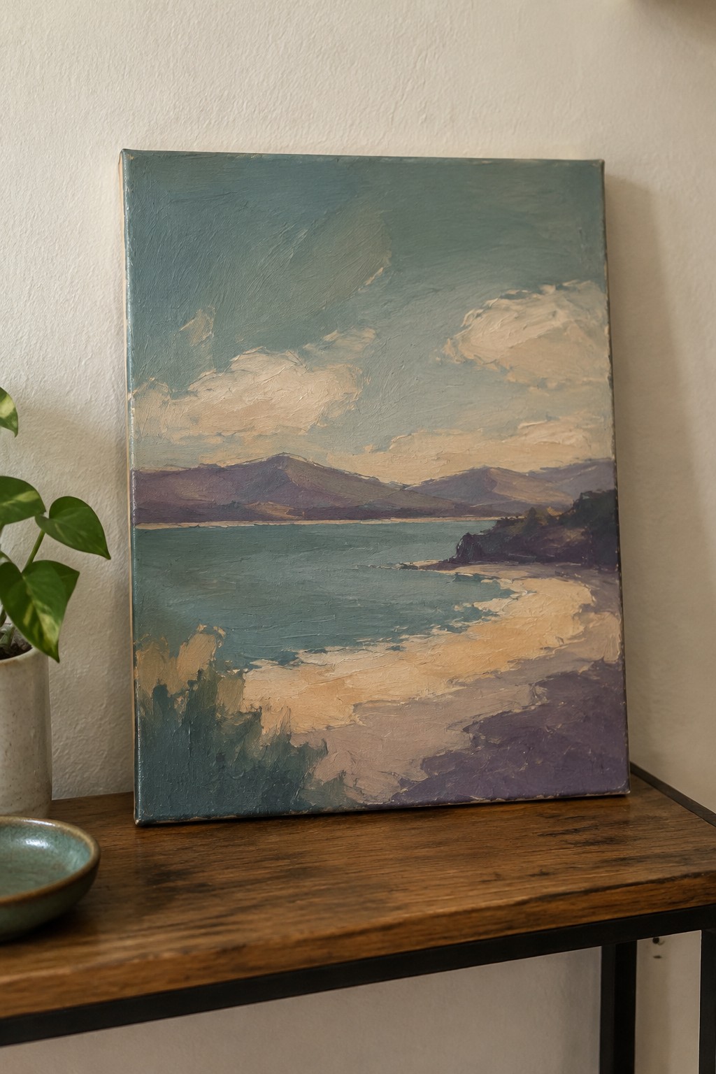
A coastal landscape idea works by stacking simple horizontal bands of sky, distant mountains, water, and shoreline to create depth without complex details. Loose brushwork and a limited palette of cool blues, greens, and purples with warmer cloud and sand accents keep the focus on shape and color rather than precision. This approach fits the landscape category and translates well to wall art because the broad forms remain clear even when viewed from across a room.
The composition does a lot of the work here since the layered structure makes it straightforward to block in with bigger brushes first. You can easily adapt the color palette to echo other pieces in a living room or swap the mountains for different landforms if you want variety. For practice, this kind of subject helps build confidence with value shifts and edges while still producing a finished piece that reads clearly from a distance.
Neutral Grid Abstract with One Accent Block

A grid of soft rectangles in layered grays, creams, and off-whites creates an abstract wall piece that stays calm while still holding visual weight. The hand-painted lines vary slightly in thickness and pressure, which keeps the structure from feeling stiff or mechanical. Placing one muted pink rectangle slightly off-center breaks the symmetry just enough to draw the eye without overpowering the rest of the composition.
The color palette makes this easy to adapt to different rooms since the neutrals sit quietly behind most furniture and textiles. You could change the single accent color to match an existing pillow or rug, or adjust the grid scale depending on the canvas size you have. Because the shapes stay simple and the brushwork stays loose, the idea works well as a first large abstract project or as a quick weekend piece when you want something coordinated but not overly detailed.
Paired Horizon Watercolor Studies

These paintings use soft watercolor washes to build coordinated sky and sea scenes that share the same color family. The idea centers on creating two related pieces where one stays looser with cloud shapes and the other adds a simple beach and wave line for contrast. The gradual color blending from top to bottom keeps the focus on the horizon and makes the pair feel connected without matching exactly.
What makes this idea useful is how the wash technique lets you produce matching wall art quickly while varying the level of detail between pieces. You can easily swap in different sand tones or skip the waves if you want a calmer look. The limited palette also helps the set fit into living room decor without clashing with existing furniture or textiles. For practice, this approach works well because it builds confidence with large shapes before adding smaller details.
Concentric Rings with Scalloped Borders

This abstract painting idea centers on building a large circular design through repeated concentric rings and scalloped edges. The composition uses bold color blocks in coral red, teal, black, and beige to create strong visual contrast and clear separation between each layer. The scalloped outer edges add a decorative frame that keeps the eye moving around the piece while the central solid circle anchors the whole design.
What makes this idea useful is how the repeating ring structure handles most of the layout decisions for you. You can easily swap the color palette to match your room or shrink the scale for a smaller canvas without losing the impact. The scalloped detail works as an optional finishing step rather than something that needs perfect precision, so beginners can start with basic circles and add the edges later if they want.
Layered Abstract Shapes in Earthy Tones
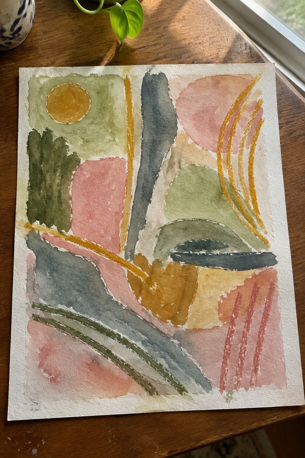
This painting idea centers on building an abstract composition from overlapping geometric and organic shapes that fill the space without a clear focal point. The approach mixes soft watercolor washes with stronger color blocks and a few linear accents to create movement across the surface. It belongs to the category of decorative abstract art that works for wall displays because the shapes stay simple while the layering adds visual interest.
The composition does a lot of the work here by letting shapes overlap and edges soften naturally rather than requiring precise drawing. You could adapt the same layout by changing the palette to cooler tones or scaling it up on a larger sheet for a bigger wall. This kind of piece stands out on Pinterest because the loose structure makes it easy to copy while still looking intentional. For practice, start with the main blocks first and add the thinner lines last so the layers stay readable.
Layered Horizon Abstracts with One Bright Accent Stripe

This idea builds a soft landscape feel through wide horizontal bands of blended neutrals, warm beiges, and muted teal blues. A single sharp coral stripe runs across the center to break up the calm layers and create a clear focal point. The loose brushwork and visible texture keep the whole piece abstract while still suggesting sky, water, and land without any defined shapes.
What makes this idea useful is how the banded format scales easily to large canvases for above-sofa displays. You can change the coral stripe to any accent that matches your room and shift the band widths to suit the canvas size. The neutral base colors make it simple to match existing furniture and pillows, while the single bright line adds just enough contrast to keep the piece from feeling flat.
Loose Watercolor Botanical Stems

A simple botanical idea works well here by painting a few leafy branches with small clustered flowers using soft watercolor washes. The stems overlap in a natural way while the color shifts from deep greens to pale yellows keep the shapes from feeling flat. This approach fits the floral category and stays light enough to hang in a living room without competing with other decor.
The composition does a lot of the work here because the branches already create movement and fill the space evenly. You can adapt the palette to echo your existing furniture tones or drop the flower clusters if you want a quicker version with just leaves. For wall art, this kind of piece stands out on Pinterest when the washes stay soft and the background stays mostly white so the greens read clearly from across the room.
Overlapping Textured Shapes in Muted Neutrals
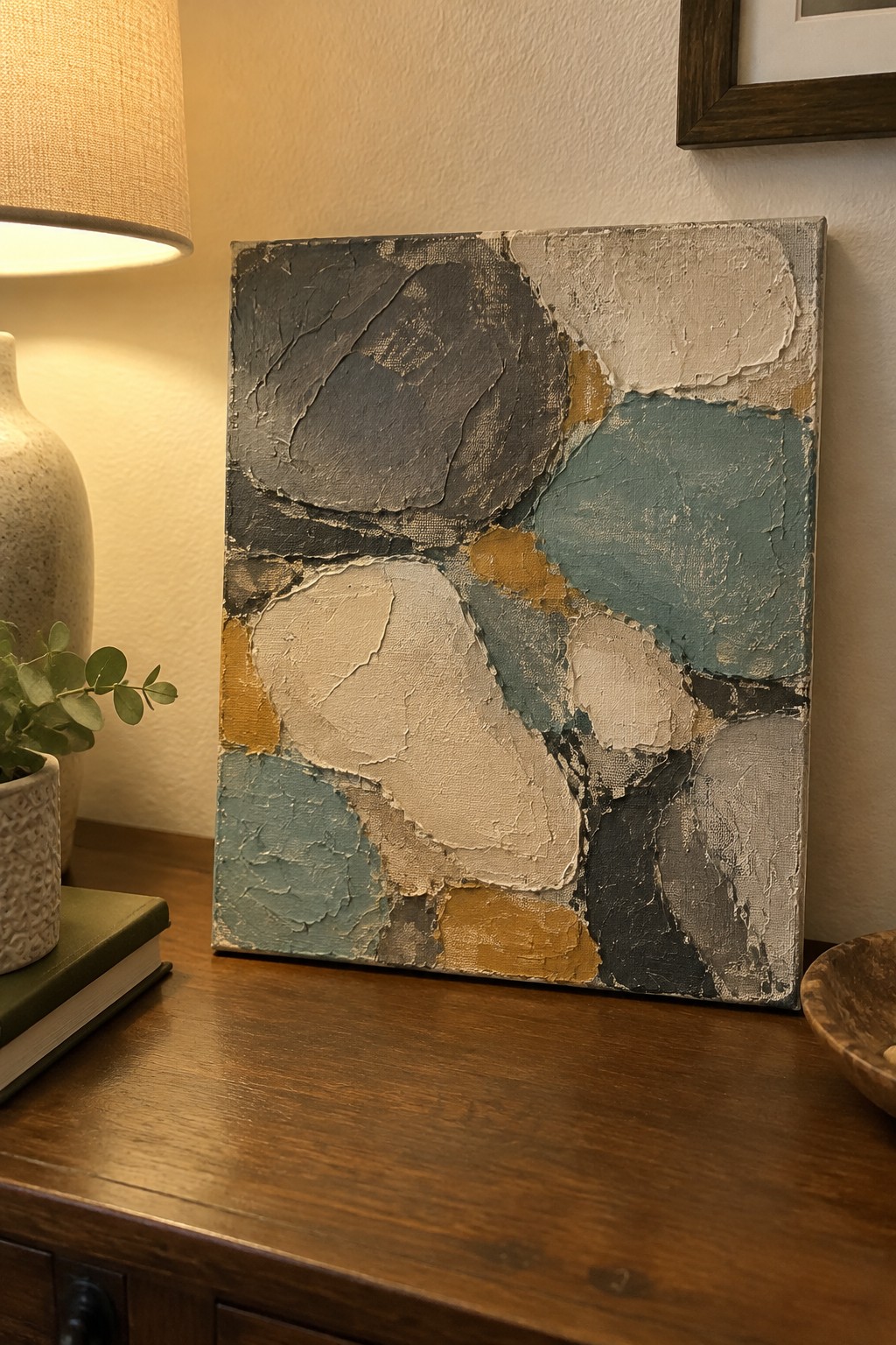
This painting idea uses large irregular forms layered over one another to create an abstract composition. The shapes vary in size and edge sharpness while sharing a limited palette of gray, teal, beige, and mustard. Thick paint application adds surface variation that catches light and gives the piece visual weight without relying on fine detail or realistic subject matter.
What makes this idea useful is how the loose arrangement of forms can be scaled up or down depending on the canvas size you have. You can block in the biggest shapes first, then overlap smaller ones to build interest while keeping the color range narrow. For wall art, this type of piece works well above furniture because the neutral tones sit comfortably with wood tones and everyday lighting. The same approach can be simplified further by reducing the number of colors or made more personal by shifting the palette to match existing room accents.
Paired Geometric Abstracts Using Arches and Vertical Blocks
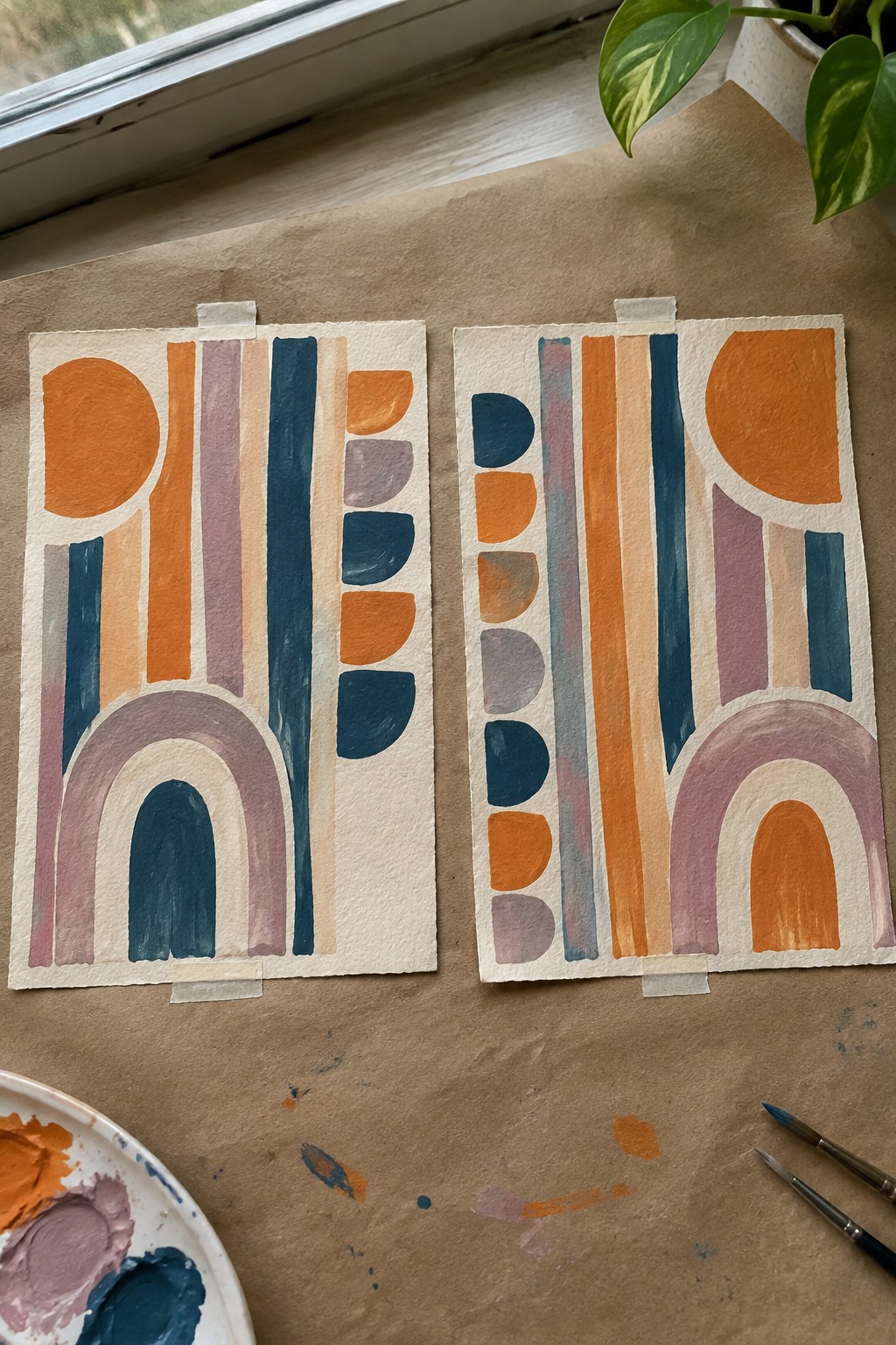
This idea focuses on creating coordinated abstract panels that repeat a few core shapes like arches, half-circles, and tall color bars to form balanced compositions. The approach uses a restrained palette of warm orange, deep teal, and soft mauve arranged in stacked and overlapping forms so the eye moves easily across the surface. It belongs to the category of decorative abstract wall art where simple repeated motifs create visual rhythm without needing fine detail or realism.
The composition does a lot of the work here because the consistent shapes let you produce matching pieces even when the exact layouts vary between panels. You can adapt the color palette to fit different room schemes or scale the whole thing down for smaller frames. For living room displays, this kind of paired abstract works especially well since the shared motifs keep the set feeling intentional while still allowing small differences between the two pieces.
Vortex Swirl Abstract with Layered Earth and Cool Tones

A strong abstract idea centers on a central vortex built from thick, directional brushstrokes that pull the eye inward. The mix of deep blues, warm browns, olive greens, and off-white creates contrast and keeps the movement from feeling flat. This type of composition works as a statement piece because the circular energy and visible texture hold attention across a room without relying on fine details or realistic forms.
What makes this idea useful is that the overlapping strokes hide small mistakes and let you build the swirl quickly in one or two sessions. You can scale the canvas down or change the balance of blue versus brown to fit your existing furniture colors. For living room walls, the loose style also photographs well for mood boards since the texture shows up clearly in photos.
Curved Color Blocks on a Circular Canvas
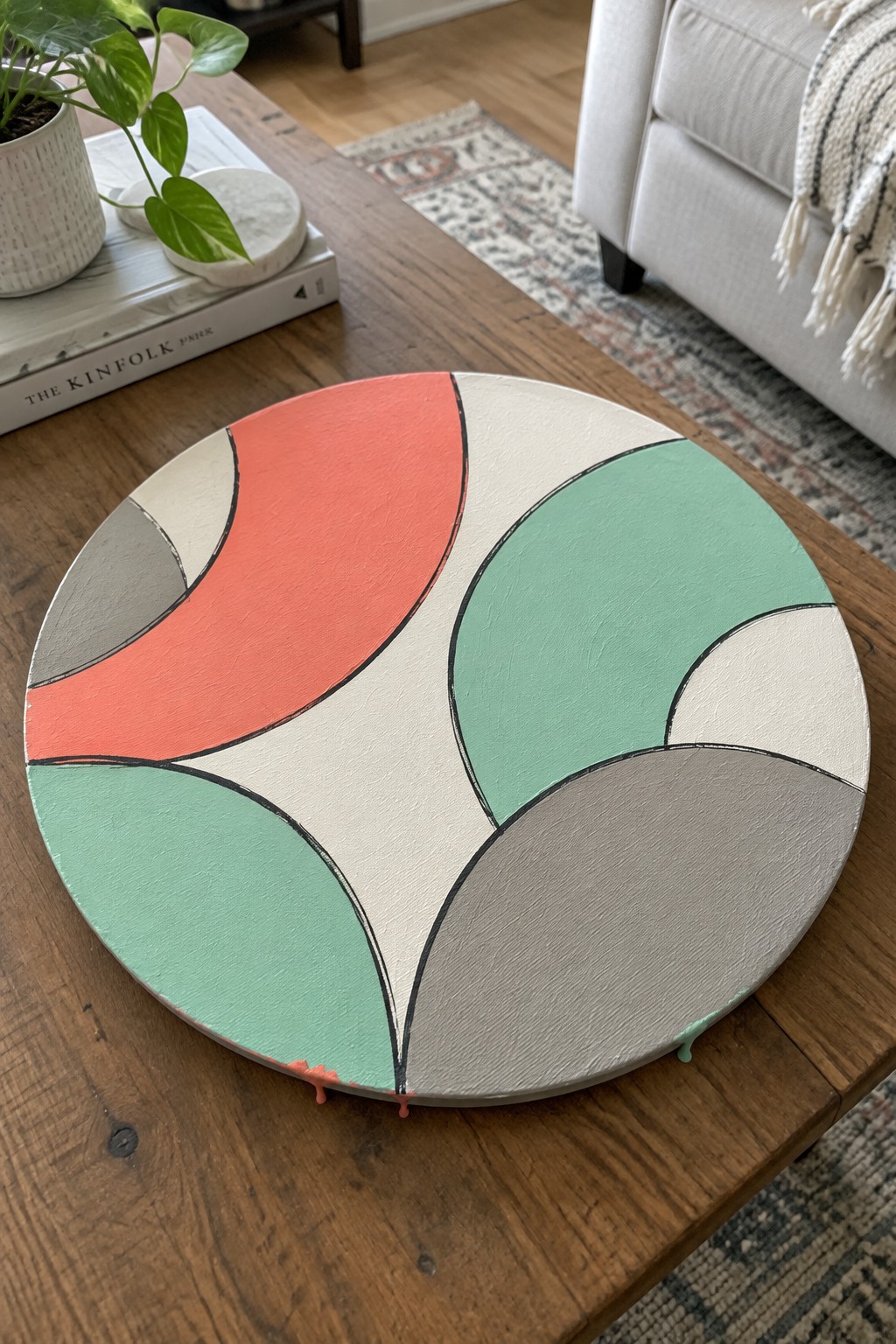
This abstract idea breaks a round canvas into flowing curved sections using thick black lines as dividers. The shapes stay simple and organic while the color blocks in coral, mint, gray, and cream sit side by side without overlapping. The black outlines give each section clear edges so the whole piece reads as one balanced design rather than separate parts.
The composition does a lot of the work here because the curves naturally follow the round format and need no extra detail to look finished. You can change the four colors to match any living room palette or scale the same layout down to a smaller canvas for a gallery wall. For practice, this kind of subject works well since the shapes are forgiving and the black lines hide small edge mistakes.
Abstract Horizon Reflections with Vertical Washes
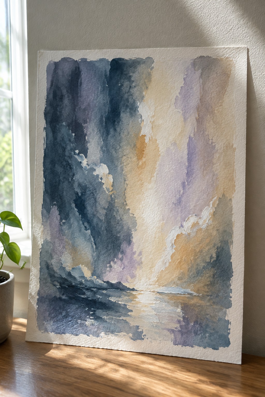
This painting idea uses tall vertical color blocks in deep blues, purples, and warm neutrals to suggest an atmospheric sky or distant forms, anchored by a horizontal band of reflected tones along the bottom edge. The composition relies on soft bleeding edges and overlapping layers to create depth and movement without any hard outlines or detailed shapes. It belongs to the abstract landscape category, where the focus stays on light, value shifts, and the way colors mirror each other across a horizon line.
What makes this idea useful is how the vertical structure can be adjusted in width and height to fit different canvas sizes while the reflection band stays consistent. The color palette works well for living room walls because the cool and warm tones balance each other and can be shifted toward more blue or more beige depending on your existing furniture. For practice, this kind of piece is approachable since it rewards loose wet-on-wet application on the top half followed by a simple value mirror below, rather than precise drawing or complex details.
Color Blocked Abstract with Loose Scribble Marks
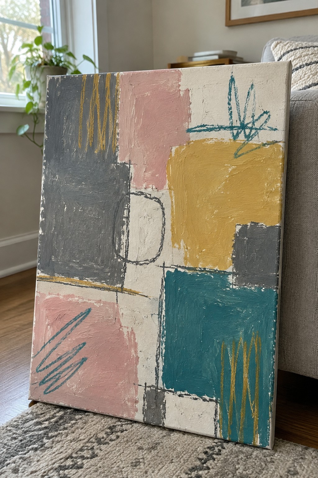
This painting idea centers on a grid of overlapping rectangles in muted gray, soft pink, cream, mustard yellow, and teal, with quick gestural lines added on top in yellow and teal. The blocks create a structured base while the scribbled marks introduce movement and contrast without filling every space. It fits the category of decorative abstract art that relies on color placement and simple layering rather than detailed subjects.
What makes this idea useful is how the block layout lets you test color pairings that already exist in your living room. You can adjust the size of the rectangles or swap one color for another to match your furniture without changing the overall structure. For wall displays, this approach works well because the neutral background keeps the focus on the shapes, and the loose marks prevent it from feeling too rigid. The same idea scales easily if you want a larger version or a set of smaller canvases with different accent colors.
Frequently Asked Questions
What colors work best for abstract paintings to coordinate with a living room’s existing furniture and decor?
Choose colors that echo the dominant tones in your sofa, rugs, and curtains while adding subtle contrasts through abstract shapes. For example, if your room features neutral grays and blues, incorporate soft washes of those hues with pops of warm terracotta or gold in the paintings. This creates visual harmony without overwhelming the space. Test paint swatches against your fabrics in natural light to confirm the match before committing to full canvases.
How can I arrange multiple abstract paintings to form a cohesive display on one wall?
Start by selecting three to five paintings from the ideas that share similar color palettes or brushstroke styles. Lay them out on the floor first to experiment with spacing, aiming for two to four inches between each piece. Hang them at eye level, around 60 inches from the floor to the center of the arrangement, and use a level to keep lines straight. This method ensures the display feels balanced and intentional rather than scattered.
What supplies do I need to create my own abstract wall paintings at home?
Gather stretched canvases in various sizes, acrylic paints in your chosen coordinating colors, brushes of different widths, and a palette for mixing. Add texture with items like sponges or palette knives for abstract effects. Protect your work area with drop cloths and seal finished pieces with a clear varnish for durability. These basic materials allow you to replicate many of the 23 ideas without specialized equipment.
How do I scale abstract paintings to fit different living room wall sizes?
Measure your wall space and select larger canvases, around 36 by 48 inches, for big blank walls to make a statement. For smaller areas above furniture, opt for medium sizes like 24 by 30 inches and group them in odd numbers. Leave enough negative space around the display so it does not crowd the room. This approach keeps the art proportional and enhances the overall flow of the living area.
What steps help maintain abstract paintings so they stay vibrant over time?
Dust the surfaces weekly with a soft microfiber cloth to prevent buildup. Avoid direct sunlight, which can fade colors, by positioning displays away from windows or using UV-protective glass if framing. If the paintings are on canvas, store extras in a cool, dry place when rotating displays seasonally. Regular care preserves the coordinated look and extends the life of your artwork.
