

I like using blues in my abstract acrylic paintings because they feel steady and easy to work with.
Expressive brushwork adds some movement that keeps things interesting without overcomplicating the piece.
I have tried different approaches over time just by starting with a color and seeing where the strokes take me.
A few of those experiments gave me ideas that I keep coming back to when I want something simple yet lively.
Here are the ones that seemed worth putting together.
Vertical Blue Brushstroke Abstracts

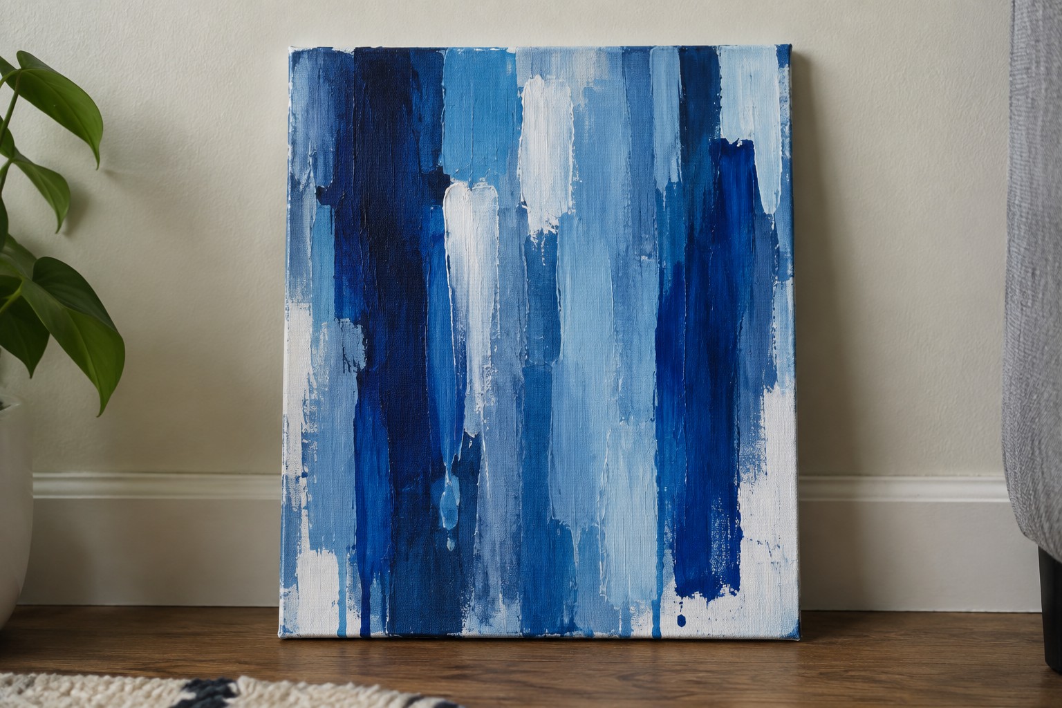
This painting idea centers on building an abstract composition entirely through vertical brushstrokes in a range of blue tones. The approach uses overlapping layers and varying pressure to create uneven bands that shift from dark navy to pale blue with white mixed in. The drips near the bottom add a simple way to let the paint move beyond the initial strokes without extra planning.
What makes this idea useful is how quickly it comes together once you pick three or four blue shades. You can easily change the width of the strokes or leave more white space to lighten the overall feel. For practice, this kind of subject helps you work on brush control and layering while staying loose. It also adapts well to different canvas sizes if you want a taller piece for a narrow wall space.
Sweeping Diagonal Brushstroke Abstract
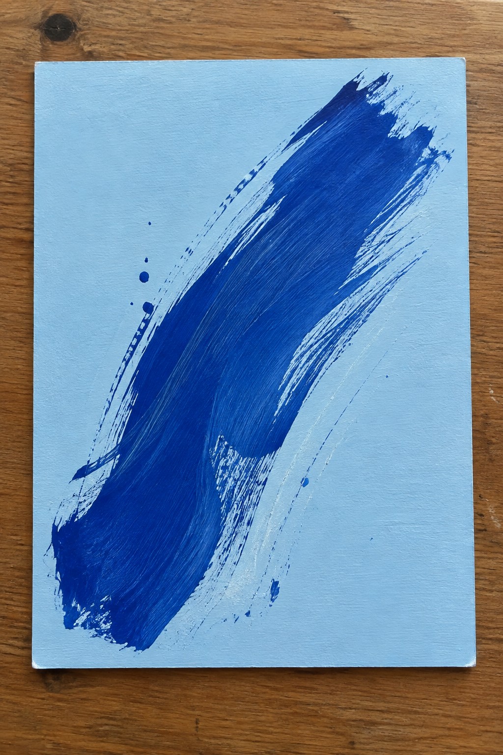
A single bold diagonal stroke in deep blue across a pale blue ground creates a strong sense of movement and contrast. The idea focuses on letting one expressive brush mark dominate the canvas while the lighter background keeps the composition open and balanced. Varied pressure along the stroke produces both thick and thin areas plus some edge splatter, which adds texture without extra elements.
What makes this idea useful is how little it requires to still feel complete. You can practice it with just two shades of blue and a wide brush, then adapt the angle, stroke width, or background tone to match different rooms or color schemes. The simple layout also works well for quick studies or larger canvases where you want one strong focal point instead of many details. For Pinterest, the clean contrast and clear brushwork make it easy to photograph and recognize in a grid of thumbnails.
Blue Swirl Vortex Abstracts

Abstract paintings built around overlapping circular brushstrokes give a clear way to practice expressive movement with acrylics. The idea uses a limited cool palette of deep blues, teals, and soft greens to let the spirals and rings stand out without competing colors. The two-panel layout works because the similar but varied swirl sizes create balance while still showing the brushwork up close.
What makes this idea useful is how the basic swirl pattern can be scaled up or down depending on canvas size. The composition does a lot of the work here by keeping shapes simple and letting the brush direction add energy. For wall art, something like this fits easily into a set of two or three pieces, and the same approach can be tried with just one dominant circle if you want a quicker version. The color palette makes this easy to adapt by swapping in different shades of blue you already have on hand.
Expressive Ocean Waves in Layered Blues
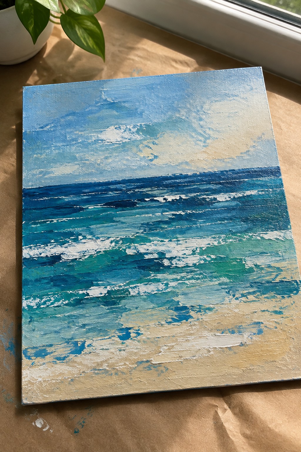
This painting idea focuses on building an abstract seascape through stacked horizontal brushstrokes that suggest rolling waves and shifting water depths. The composition uses a cool palette of navy, teal, and turquoise with white accents to create movement across the canvas, while the lower section shifts into sandy beige tones to mark the shore. The thick, directional strokes give the surface texture and help the eye travel naturally from the distant horizon down to the foreground without relying on fine details.
What makes this idea useful is the straightforward horizontal layout that keeps the focus on brushwork and color mixing rather than complex shapes. The same structure works at different canvas sizes and can be adjusted by changing how much white you add for foam or how far the sand tones extend upward. For practice sessions, this approach lets you experiment with acrylic texture and blending while still producing a finished piece that reads clearly as water and shore.
Blue Rectangle Grid Abstract
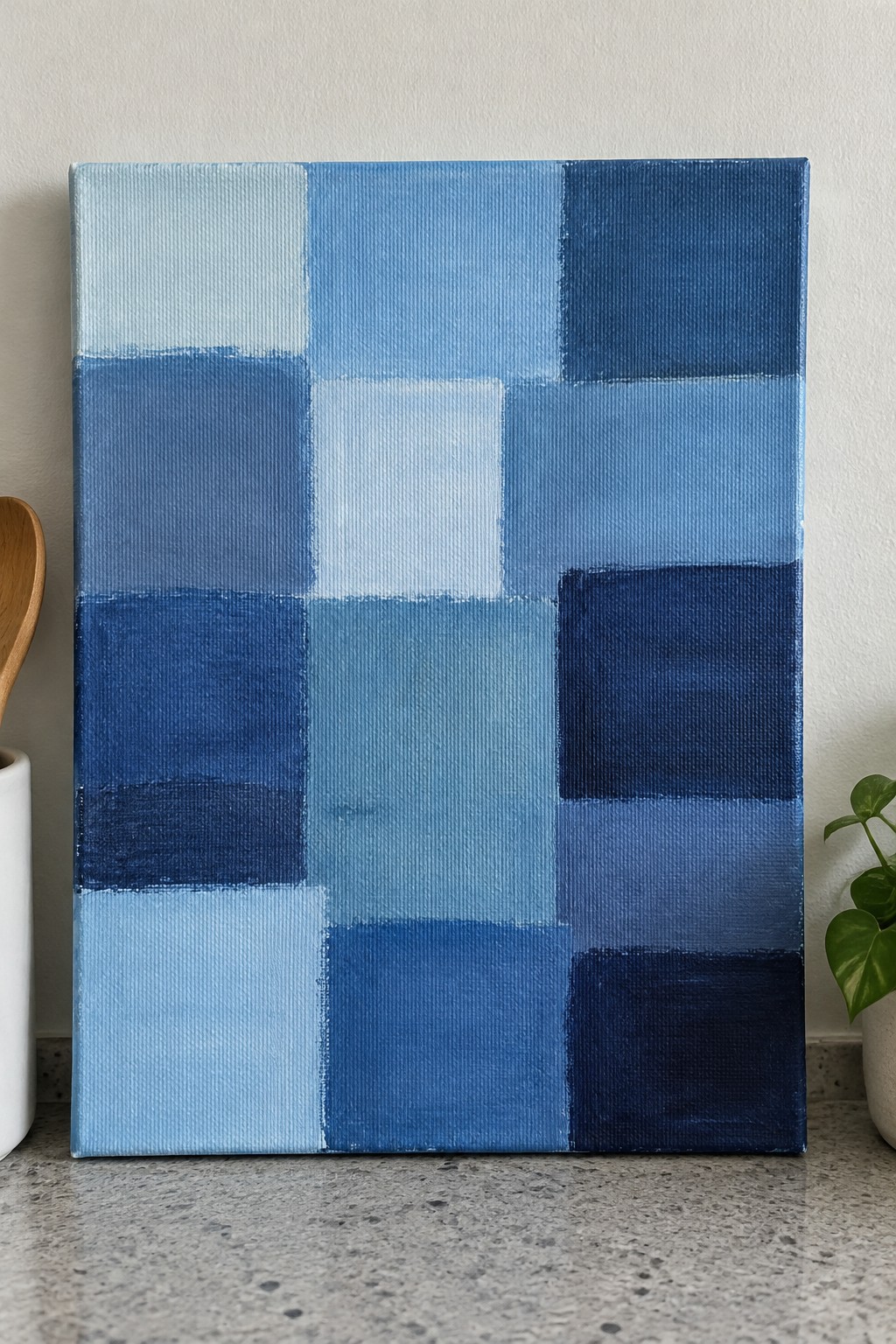
This painting idea uses a loose arrangement of rectangles filled with different blue tones to create an abstract composition. The shifts from pale to deep blue give the piece structure while still allowing the eye to move freely across the surface. Visible brushstrokes keep the blocks from feeling flat and add just enough texture to hold interest.
What makes this idea useful is how simple it is to change the number or size of the rectangles depending on your canvas. You can work with a tighter grid for more complexity or keep the blocks larger for quicker coverage. The single-color focus also makes it easy to experiment with brush direction and pressure without worrying about matching multiple hues. For practice or quick wall pieces, the format adapts well to whatever size or shade range you have on hand.
Layered Circular Strokes in Blue
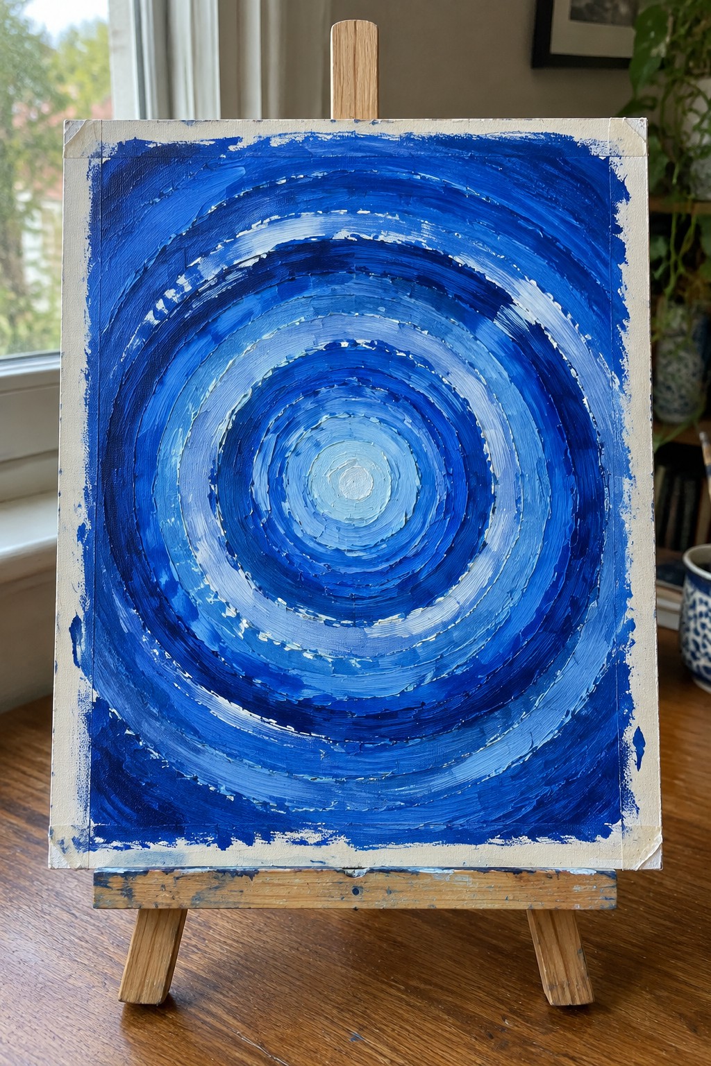
This abstract idea centers on building a composition from overlapping circular brushstrokes that radiate outward from a central point. The color shifts from deep navy on the outer rings to pale blue at the core create a clear focal point while the visible directional strokes add texture and movement. It fits squarely into abstract decorative art where the emphasis stays on brushwork and color gradation rather than any recognizable subject.
What makes this idea useful is how the circular layout does most of the compositional work for you. You can start with a single color family and simply vary the pressure and direction of each ring to build depth without needing precise planning. The same approach adapts easily to other palettes or even a rectangular canvas if you keep the rings slightly off-center. For practice sessions this subject lets you focus on stroke consistency and blending while still producing something bold enough to hang.
Blue Horizontal Gradient Layers
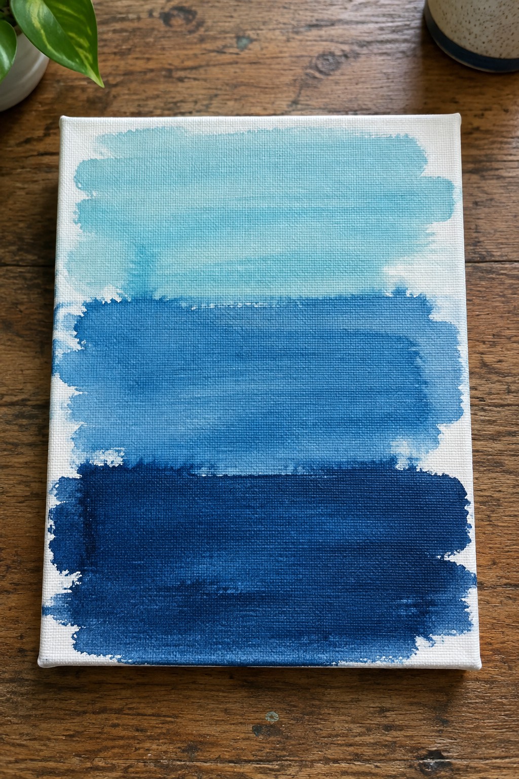
This painting idea centers on an abstract composition made from three wide horizontal bands of blue that shift from a pale turquoise at the top through a mid-tone blue and down into a deep navy. The loose brushwork and feathered edges between each band create natural transitions while keeping the overall layout clean and balanced. It works as a straightforward abstract approach that emphasizes color shifts and texture over any specific subject.
What makes this idea useful is how the stacked bands give you an easy structure to follow while still leaving room to play with blending and edge control. You can adjust the number of layers or swap in cooler or warmer blues depending on the mood you want. For practice, the format helps you work on large, even strokes without worrying about details. This would be easy to turn into a series by changing the width of each band or letting the paint run a little more freely between layers.
Dynamic Diagonal Brushwork in Blues and Gold

This painting idea centers on building an abstract composition through overlapping diagonal strokes that move across the canvas in different directions. The core concept uses a dominant cool palette of blues and teals with scattered warm yellow accents to create contrast and visual movement. The approach works because the varied stroke widths and directions keep the eye traveling without needing a clear subject or focal point.
What makes this idea useful is how easily the same layout can be adjusted by changing the angle of the strokes or swapping the yellow accents for other warm tones like orange or copper. The composition handles most of the interest through mark-making alone, so it serves as solid practice for controlling acrylic paint consistency and pressure. For wall pieces, the strong diagonal lines give it enough energy to stand out even in smaller sizes, and the idea adapts well if you want to try it vertically or on a wider format.
Layered Blue Seascape with Vertical Drips

This idea focuses on an abstract ocean view created through broad horizontal brushstrokes in multiple blue tones that suggest moving water and distance. A darker mass on the left side anchors the composition while vertical drips add texture and break up the surface. The soft transition from darker foreground to lighter background keeps the eye moving across the canvas without relying on sharp details.
What makes this idea useful is how the drips and loose blending create most of the interest with minimal extra work. You can shift the palette toward deeper navy or cooler gray-blue to change the mood while keeping the same layout. For wall art the horizontal flow works well at larger sizes, and the approach scales down easily for smaller canvases or quick studies where you want to practice blending and controlled drips.
Overlapping Blue Circles in Varied Shades

This idea uses repeated circular shapes layered across the canvas in a full range of blues from pale to deep navy. The loose brushwork lets each circle keep its own texture while the overlaps build a dense, even pattern without any focal point. It works as a straightforward abstract study that relies on color variation and repetition to fill the space.
The composition does a lot of the work here by creating movement through the scattered overlaps rather than any planned layout. You can adapt it easily by shifting the blue range toward teal or adding more white for a softer look, or by changing canvas size to suit a larger wall piece. For practice this kind of subject helps you work on brush control and quick color mixing in one family without needing complex planning. It also reads well as a thumbnail on Pinterest because the pattern stays clear even when scaled down.
Sweeping Curved Brushwork in Navy and Teal

An abstract painting built around one large curved shape works well when you let wide brushstrokes carry the movement from the bottom left up and across to the right. Use a dark navy base and gradually add thicker layers of teal and turquoise along the curve so the color shifts feel natural while the texture stays visible. The idea stays simple because the composition relies on the contrast between the solid background and the single directional form rather than multiple elements.
The composition does a lot of the work here since the curve already fills the space and creates balance on its own. You can swap the teal tones for any color family or scale the same stroke pattern down to a smaller canvas without losing the impact. For practice, this kind of piece helps you focus on brush pressure and edge control while still finishing something that reads as intentional wall art. It also adapts easily if you want to try a vertical version or repeat the curve in a mirrored pair.
Vertical Blue Strokes with Sparse Dark Accents
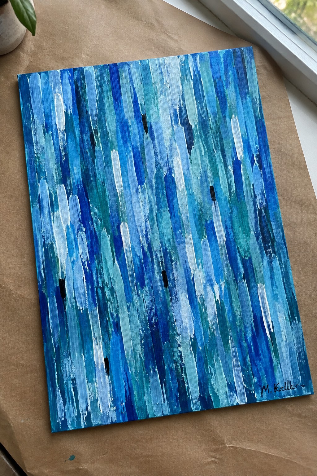
An abstract idea built around vertical brushstrokes in layered blues creates movement and texture without a central subject. The composition works by varying stroke width and tone from light to deep blue so the surface feels active while staying balanced. A few small black marks scattered across the canvas add just enough contrast to prevent the pattern from feeling too uniform.
What makes this idea useful is how directly it practices expressive brushwork with a limited palette. The color palette makes this easy to adapt by shifting toward greens or purples or by adjusting how much white you mix in for highlights. For wall art, something like this suits spaces that need texture but not a busy focal point. You could simplify it further by using only three blues or enlarge the strokes on a bigger canvas for more impact.
Layered Blue Waves with Horizontal Brushstrokes

An abstract seascape idea built from overlapping horizontal brushstrokes creates bands of ocean movement across the canvas. The composition relies on shifting shades of blue and teal to suggest depth, with lighter strokes breaking through to imply foam on the water surface. This approach fits the abstract landscape category and keeps the focus on texture and color variation rather than specific shapes.
What makes this idea useful is how the repeating horizontal layout handles most of the composition work without needing complex planning. The color palette stays easy to adapt since you can swap in more greens or deeper navy tones depending on the supplies you have. For practice, this kind of subject lets you work on broad stroke control while still leaving space to vary pressure and layering. A painting like this translates well to different canvas sizes for quick wall pieces or color studies.
Blue Geometric Abstract with Angular Shapes
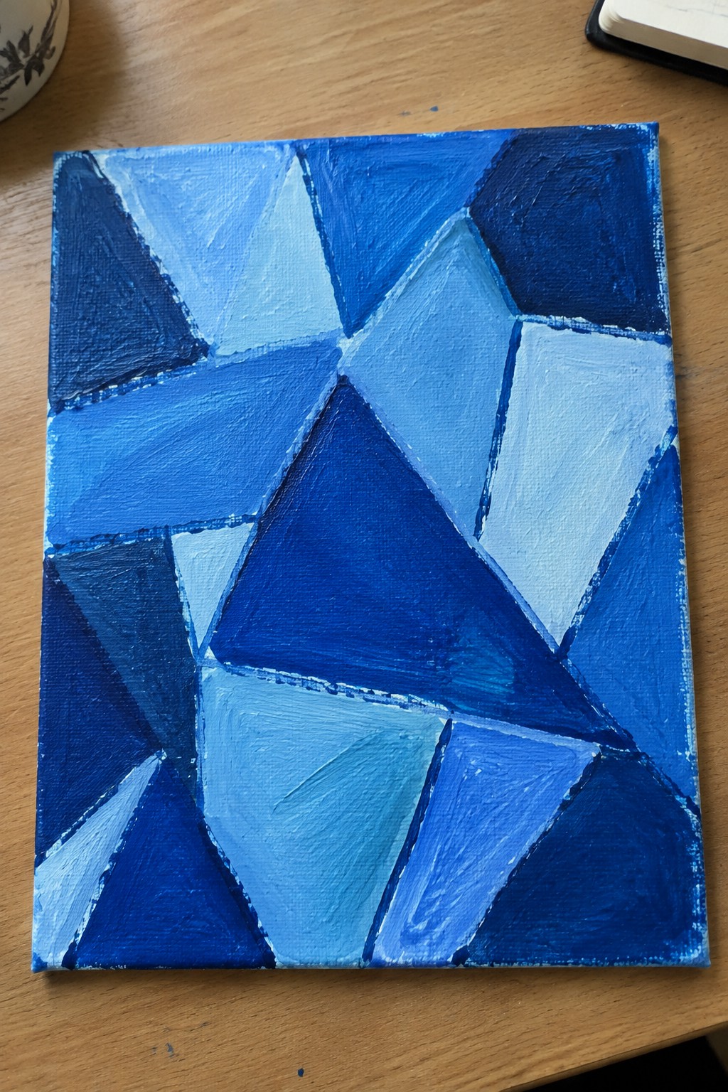
This painting idea centers on an abstract composition built from interlocking triangles and polygons filled with a range of blue shades. The shapes fit together like a loose mosaic, using lighter and darker tones to create contrast and movement across the surface. Visible brushstrokes add texture while keeping the focus on color shifts and angular forms rather than fine detail.
The composition does a lot of the work here by letting the shapes and color changes carry the interest without extra elements. You can adapt it easily by swapping the blues for another single-color family or scaling it down for smaller practice pieces. For beginners, this approach works well to practice brush control and edge blending in one session. It would also translate nicely to wall art since the structured layout keeps it looking intentional even with loose paint application.
Expressive Blue Seascape Built from Directional Brushstrokes

A seascape idea that uses thick, overlapping brushstrokes in multiple blue values to suggest waves meeting rocky shapes and an open sky above. The composition relies on strong horizontal bands and varied stroke directions to create depth without adding extra colors or fine details. This fits the abstract landscape category where texture and value changes carry the visual weight.
The single-color approach keeps mixing simple while still giving room to play with light and dark passages across the surface. You can easily adapt the size or stretch the same stroke patterns into a wider or taller format depending on the space you want to fill. The clear separation between the upper and lower sections makes it straightforward to start and adjust as you go.
Overlapping Rounded Shapes in Cool Blues

This abstract idea centers on building a composition from overlapping circles and ovals in a tight range of blues, from pale turquoise to navy. The shapes vary in size and sit at different angles, which creates natural depth through simple layering and partial overlaps. Expressive brushwork shows in the visible strokes and uneven edges, giving the forms texture without added detail.
What makes this idea useful is how the overlapping layout does most of the work for you, so you can focus on color mixing and brush pressure instead of planning a scene. The cool palette stays easy to match if you want to swap one or two tones or add a single small accent like the gold dot. For practice, this kind of piece works well because you can start loose on a small canvas and still end up with something balanced enough for a wall.
Dynamic Blue Splatter with Bold Brushstrokes

This idea focuses on building an abstract composition through layered brushstrokes combined with loose splatter and drip marks across a light blue ground. The contrast between the heavier blue strokes and the scattered dots creates visual movement without needing any defined subject. It works as a straightforward abstract approach that emphasizes gesture and color variation over detail.
What makes this idea useful is how the splatter technique covers a lot of canvas quickly while still allowing control over the main strokes. You could scale it down to a smaller panel for practice or stretch it across a larger canvas for wall impact. Shifting the background to a slightly warmer tone or limiting the drips to one side would change the feel without changing the core method. The vertical drips also help the piece read well from a distance, which is handy for decor pieces.
Vertical Blue Split with Textured Contrast
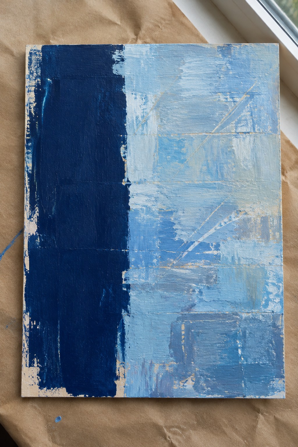
This abstract idea uses a bold vertical divide to separate a dense dark blue block from a lighter blue area built with multiple overlapping brushstrokes. The left side stays mostly solid while the right side shows varied pressure, direction, and some thin diagonal marks that add movement without clutter. The cool palette and strong value contrast make the split the main focus.
The composition does a lot of the work here because the vertical line creates instant structure that needs little extra planning. You can easily shift the width of the dark section or swap in any two blue tones you already have. This works well for practice on edge control and brush texture, and the finished piece has enough presence to stand out as a simple wall piece or quick study.
Abstract Night Reflections Using Vertical Drips
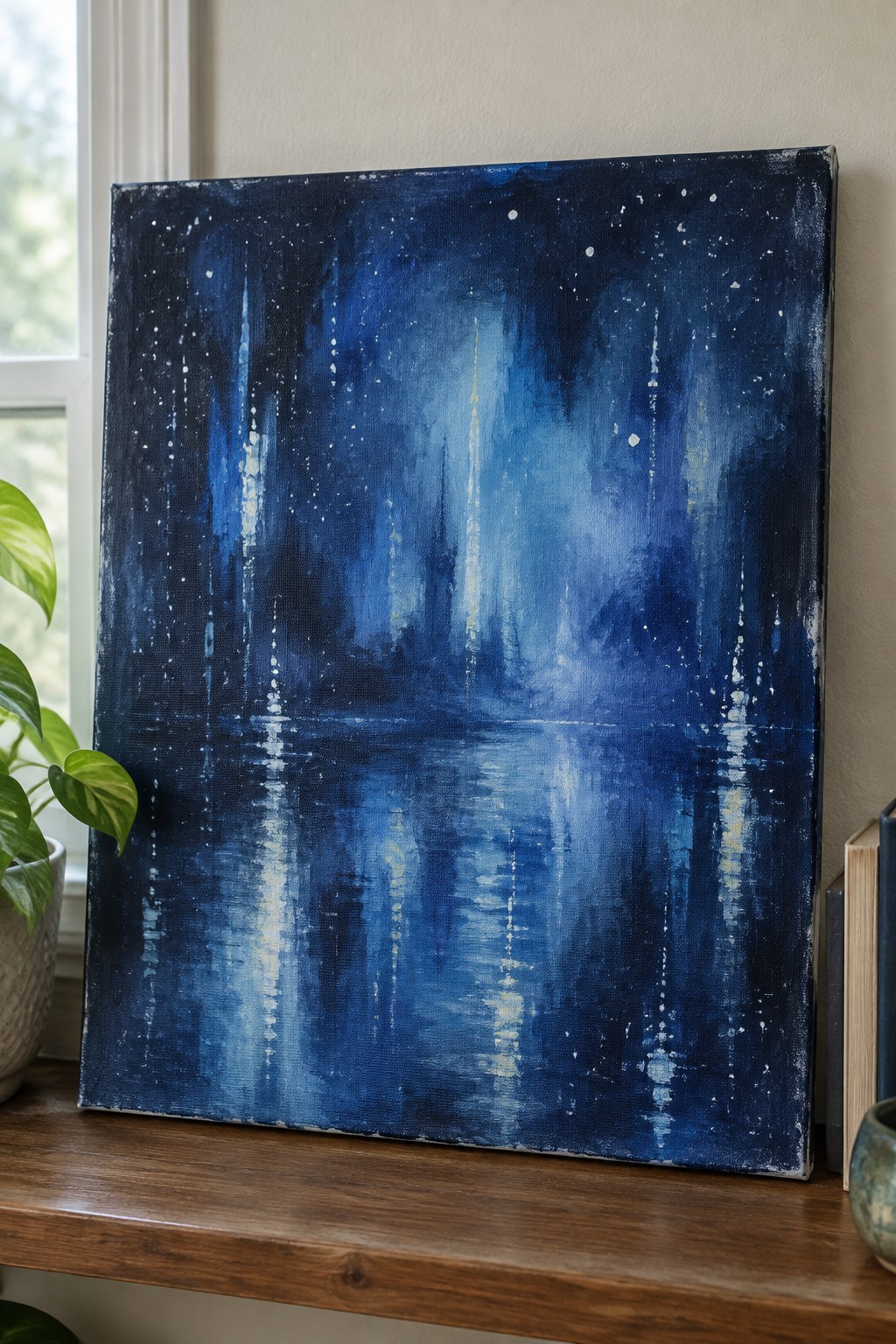
This idea centers on an abstract city view at night, where vertical drips and loose brushstrokes suggest tall buildings and glowing lights. The composition splits horizontally so the lower half acts as a reflection, creating balance between the busy upper area and the calmer mirrored section below. Deep blues with scattered white and pale yellow marks keep the focus on light and movement rather than precise shapes.
What makes this idea useful is how the drips do most of the work for texture and interest. You can easily change the canvas size or swap in different blue mixes to match your space. The reflection line also helps the piece look finished even if your brushwork stays loose, which makes it a solid choice for practice or quick wall art.
Layered Blue Brushwork Abstract
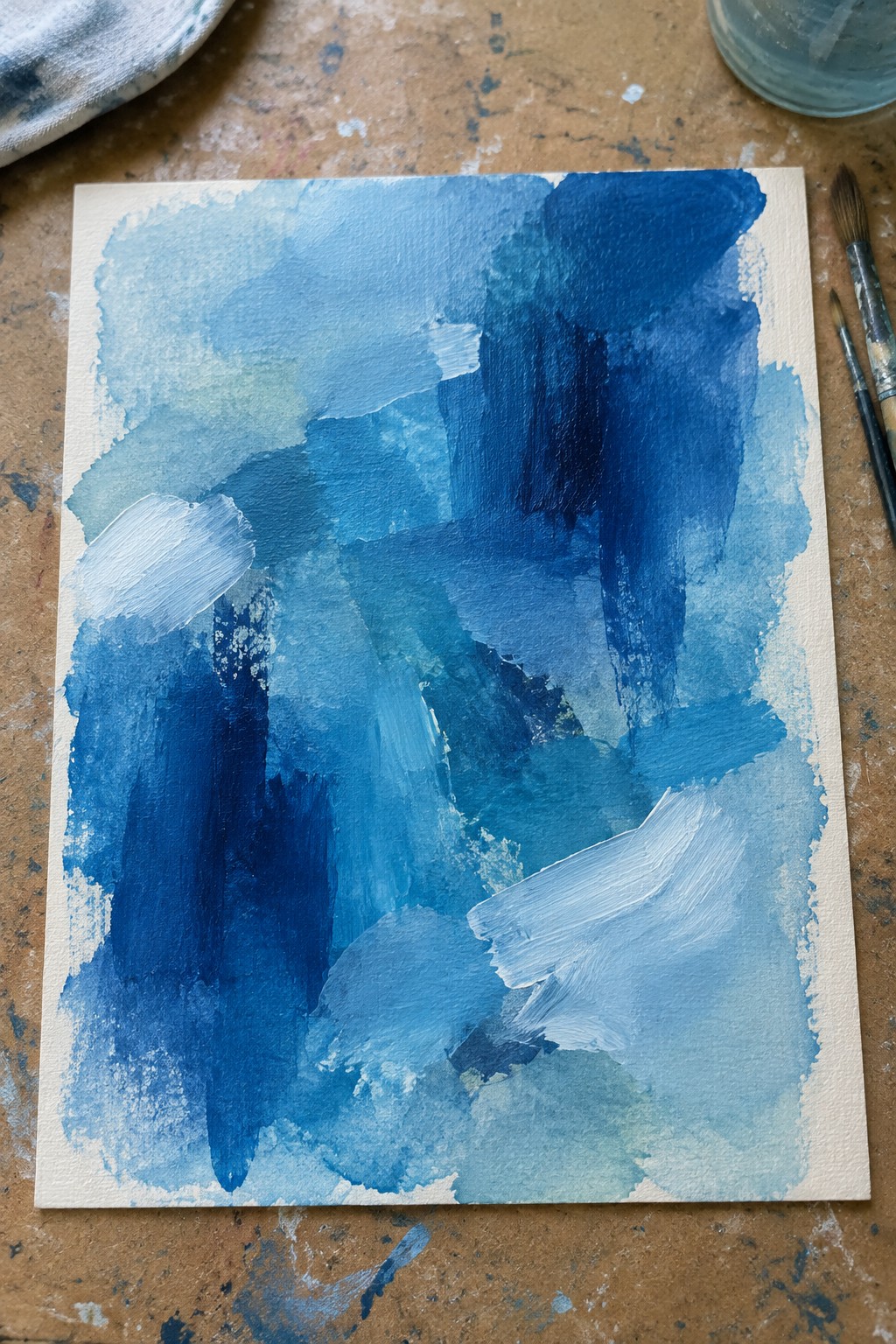
This painting idea uses overlapping blue tones applied with a mix of broad washes and thicker, directional strokes to create an abstract composition. The visual interest comes from the contrast between soft blended areas and sharper, textured marks that keep the eye moving across the surface. It fits squarely in the abstract category, where color shifts and brush variation replace any need for a subject.
The composition does a lot of the work here by balancing heavier dark sections with lighter open space so nothing feels crowded. You could adapt the idea easily by switching to a cooler or warmer blue family or by repeating the same strokes on a smaller panel for a diptych. For practice, this approach helps you test how different brush pressures and water ratios affect texture without planning any specific image. It would pin well as a straightforward example of expressive abstract work that still looks intentional.
Overlapping Blue Circles With One Orange Accent

This abstract idea centers on building depth through rounded blue shapes in varying tones and sizes layered across a light background. The single orange block breaks up the cool palette and draws the eye without complicating the overall layout. It fits the expressive brushwork category because the visible strokes and overlaps create movement while staying simple in subject.
What makes this idea useful is how the limited shapes and one contrasting accent let you focus on texture and layering without getting stuck on details. You can easily swap the orange for another hue or adjust the size of the circles to fit different canvas dimensions. For practice, this kind of layout works well because it builds confidence with acrylic handling and shows up nicely in photos for sharing.
Frequently Asked Questions
What supplies do I need to create these blue abstract acrylic paintings with expressive brushwork?
You will need acrylic paints in various shades of blue such as ultramarine, cobalt, and cerulean along with white and black for mixing. Gather a selection of brushes including flat, round, and fan types for different stroke effects. Add a canvas or heavy paper, palette, water container, and rags for cleaning. A medium like gel can help with texture if you want thicker applications.
How do I achieve expressive brushwork when painting these abstract blue ideas?
Start by loading your brush with plenty of paint and apply it with bold sweeping motions or quick dabs to build energy on the canvas. Vary your pressure and angle to create thick and thin lines that suggest movement. Practice on scrap paper first to see how wet and dry brushing changes the look. Layer strokes while the paint is still wet for soft blends or let layers dry for sharper contrasts.
Which blue shades work best together in these abstract compositions?
Cool tones like deep navy pair well with lighter turquoise for depth and calm feelings. Add hints of purple blue or teal to add interest without clashing. Test mixes on a palette to see how they interact under different lights. Use a limited palette of three or four blues at first to keep the focus on the brushwork rather than too many colors.
Can beginners successfully try these 21 painting ideas?
Yes beginners can start with simpler versions of the ideas such as basic wave patterns or loose color fields. Focus on one technique at a time like practicing strokes before adding details. Many of the concepts build from basic shapes so you can scale them to your skill level. Watching short videos on acrylic handling helps build confidence quickly.
How should I finish and display my completed blue abstract acrylic paintings?
Let the paintings dry fully for at least 24 hours before applying a varnish to protect the surface and enhance colors. Choose frames that complement the blues such as simple black or wood tones. Hang them in well lit areas where the brushwork can be seen up close. If selling your work photograph it in natural light and include details about the techniques used.
